Selected Projects
A curated selection of projects across body objects, visual systems, spatial narratives, and speculative brand worlds.
Context
Commissioned for the creation of a new fashion-led eyewear brand from the ground up, with full creative freedom in defining its identity, products, and visual world.
Scope
Brand concept and complete identity system
Development of a 25-piece wearable collection spanning eyewear,
jewelry, and body objects
Establishment of manufacturing partnerships for 3D printing and coating processes
Campaign art direction, photography, and visual world building
Website visual direction and UI concept
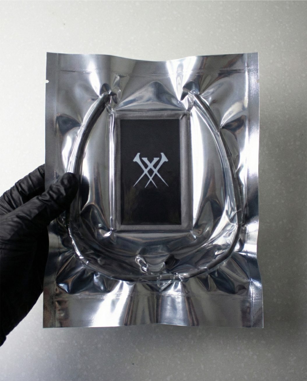
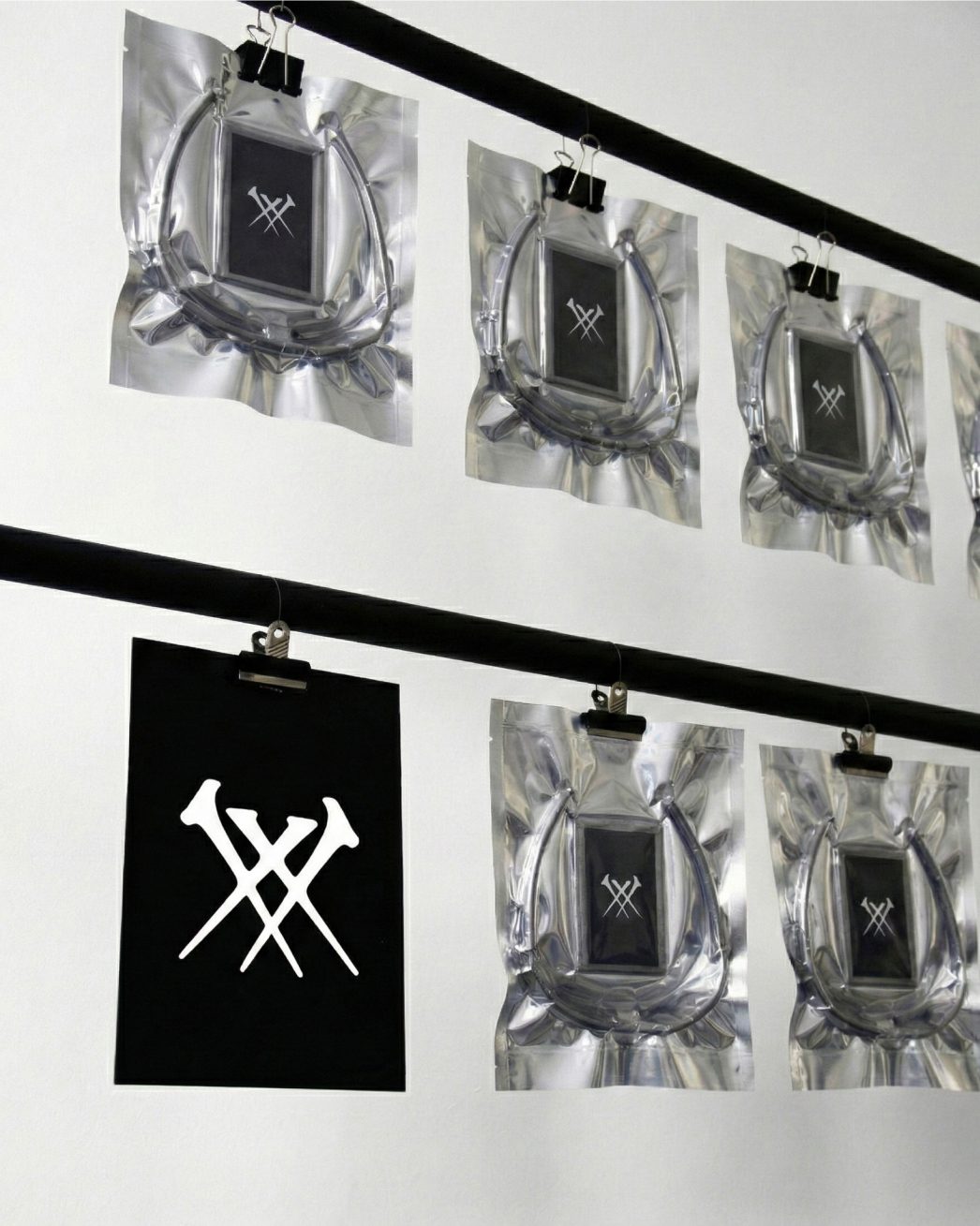
Packaging system and material language
Launch event design with spatial and experiential thinking
Outcome
A fully operational brand system prepared for SS26 launch, connecting product, identity, campaign, digital, and space into a unified visual world.
Problem
The original brief called for a new eyewear brand entering a saturated Korean market. Rather than competing in that category directly, the strategy repositioned the project as a wearable objects brand where eyewear is one element of a larger design system — moving into a less crowded space while building a richer identity.
Reposition
Budget and production constraints became a defining advantage. The brand was designed around made-to-order digital fabrication, enabling sustainable, waste-minimal production with no inventory, reduced cargo, and the capacity to scale without infrastructure. Some pieces also exist as downloadable 3D files, allowing local printing and adaptation by the wearer.
Position
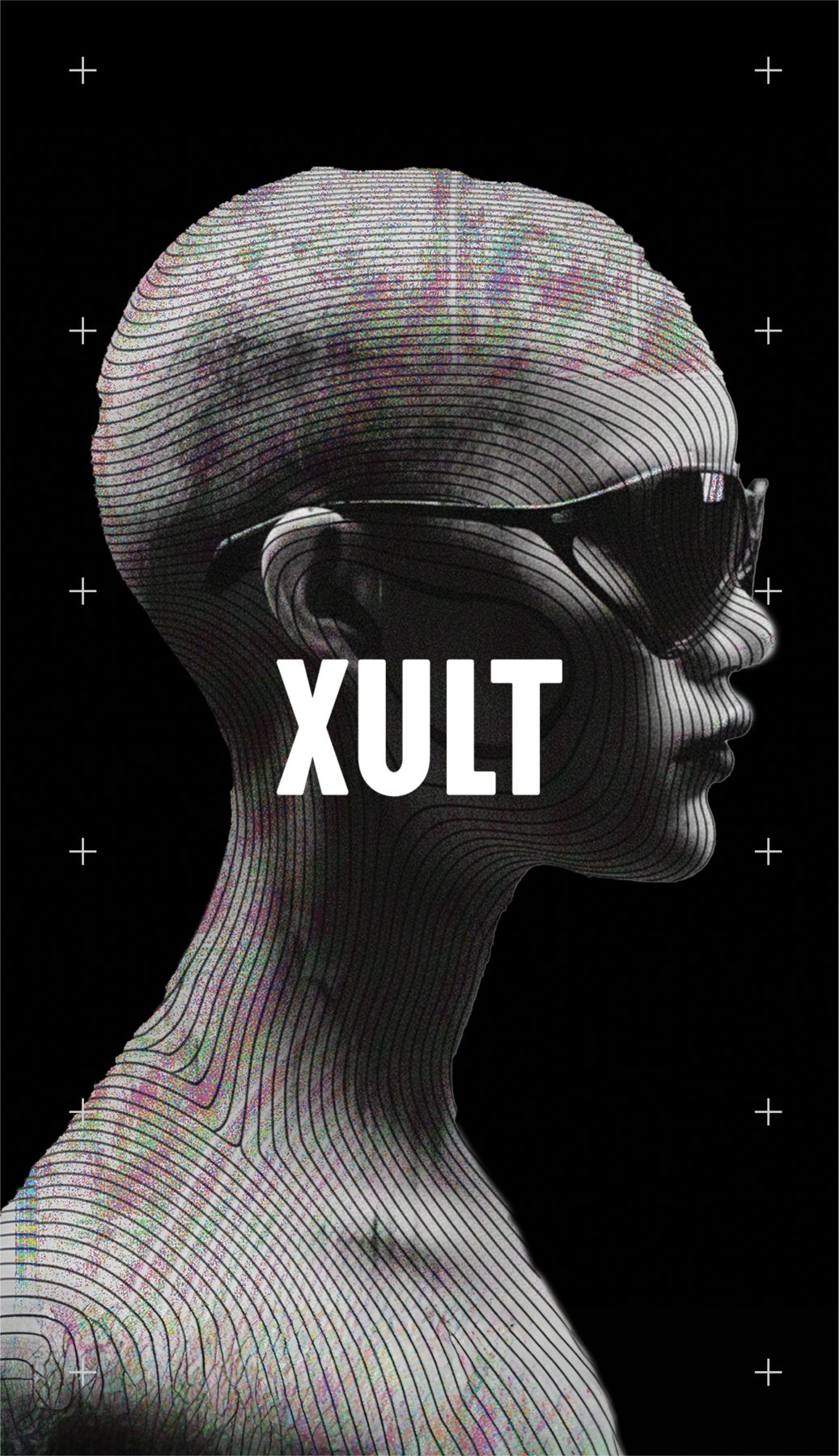
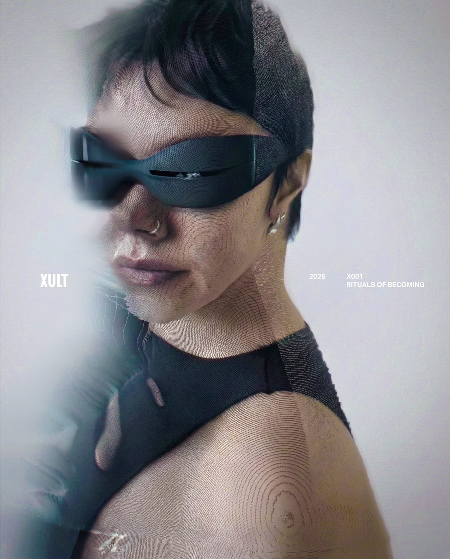
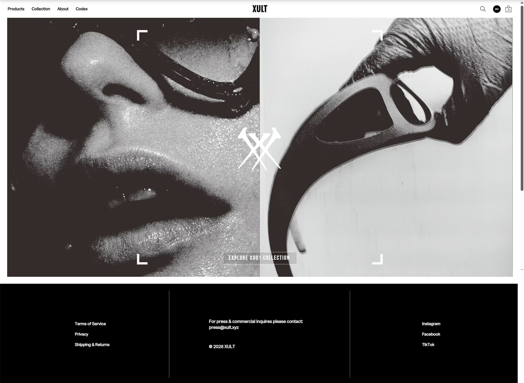
XULT is positioned at the intersection of fashion, speculative design, and digital fabrication — a design laboratory with commercial outputs, targeting a culturally engaged, design-literate audience drawn to post-human ideas about body, identity, and technology.

Concept
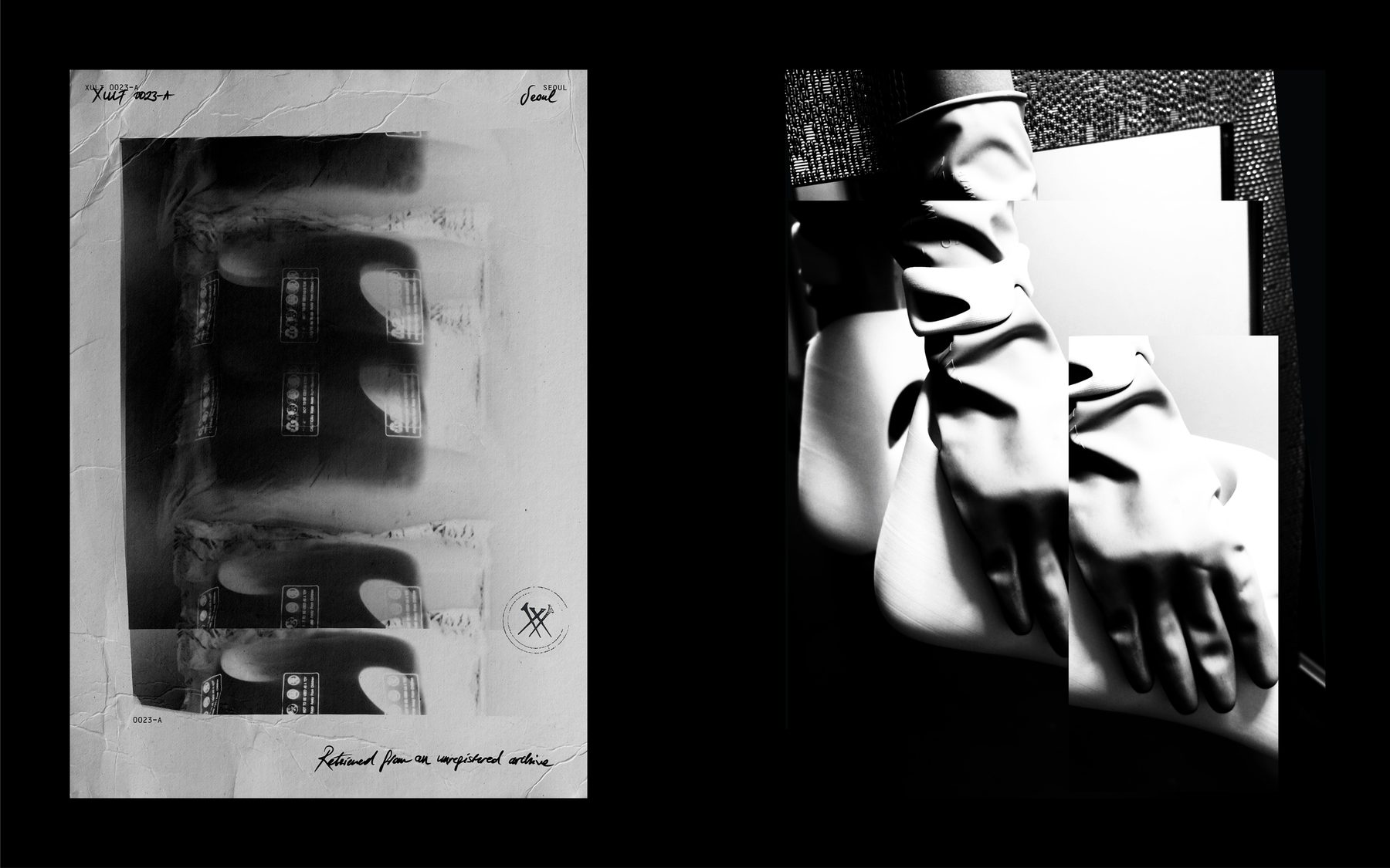
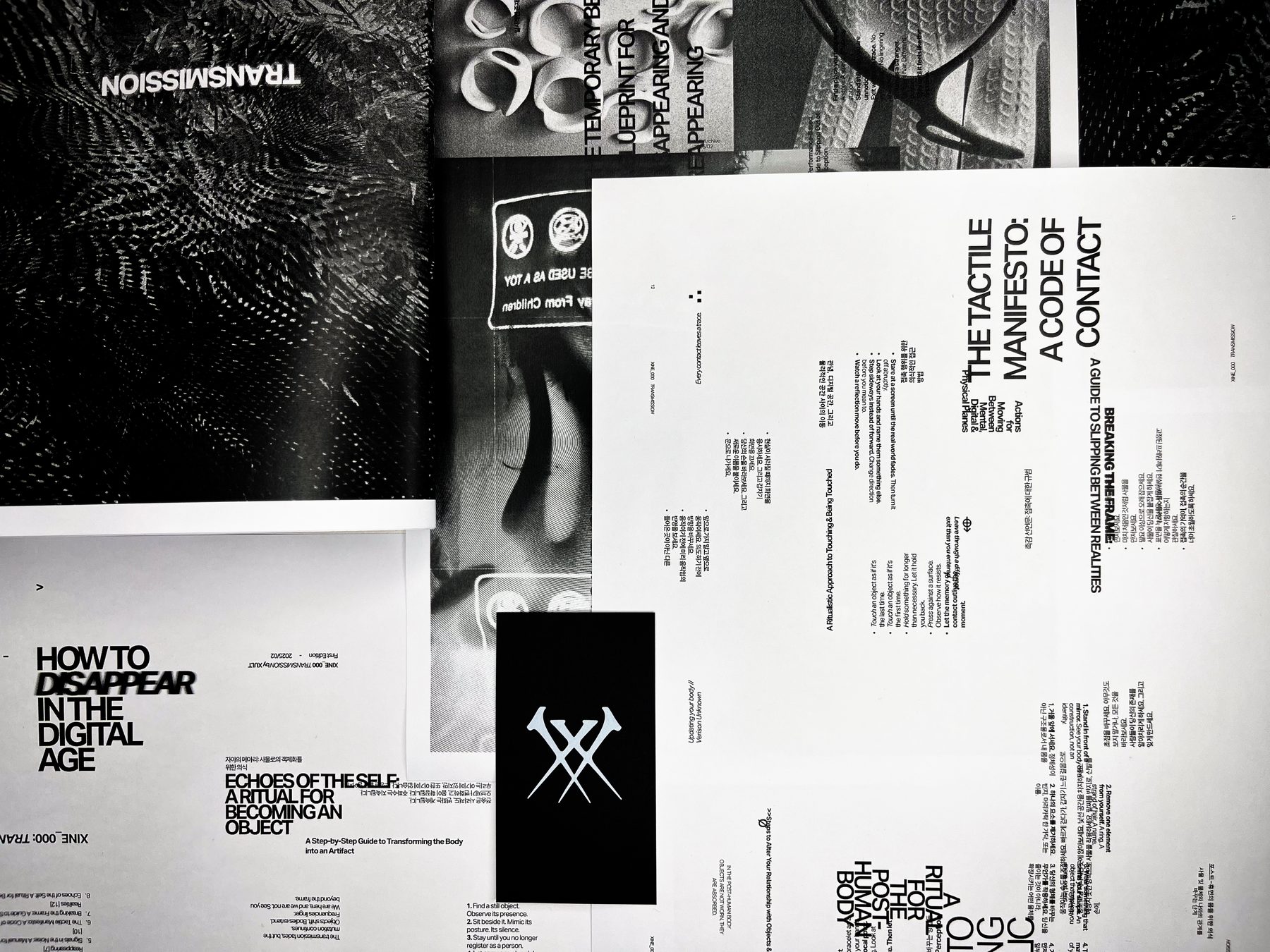
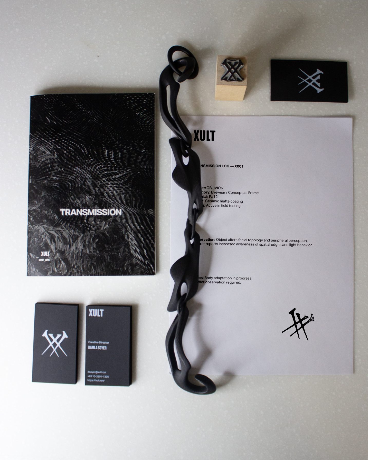
The identity was conceived as a visual system for a speculative laboratory rather than a fashion label. The mark, typography, and graphic language resemble tools, symbols, and documentation traces — communicating process and research rather than style or trend.
System
The system extends into packaging, printed matter, stamps, cards, and the XINE_000 zine, which operates as the strongest standalone artifact. A custom XULT typeface anchors a three-tier typographic hierarchy, and every graphic element frames the product as part of an ongoing material investigation.
Logic
The monochrome palette keeps focus on texture, form, and material. The identity operates as narrative structure: not decoration, but a system that reinforces the idea of objects as extensions of the human body within a post-human context.
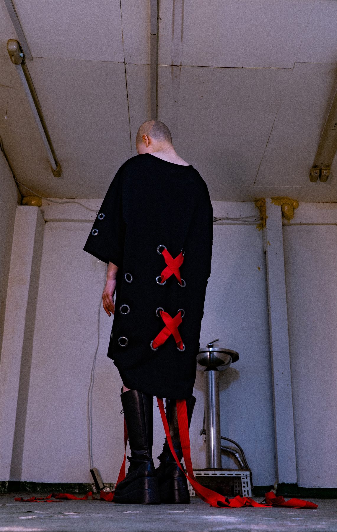
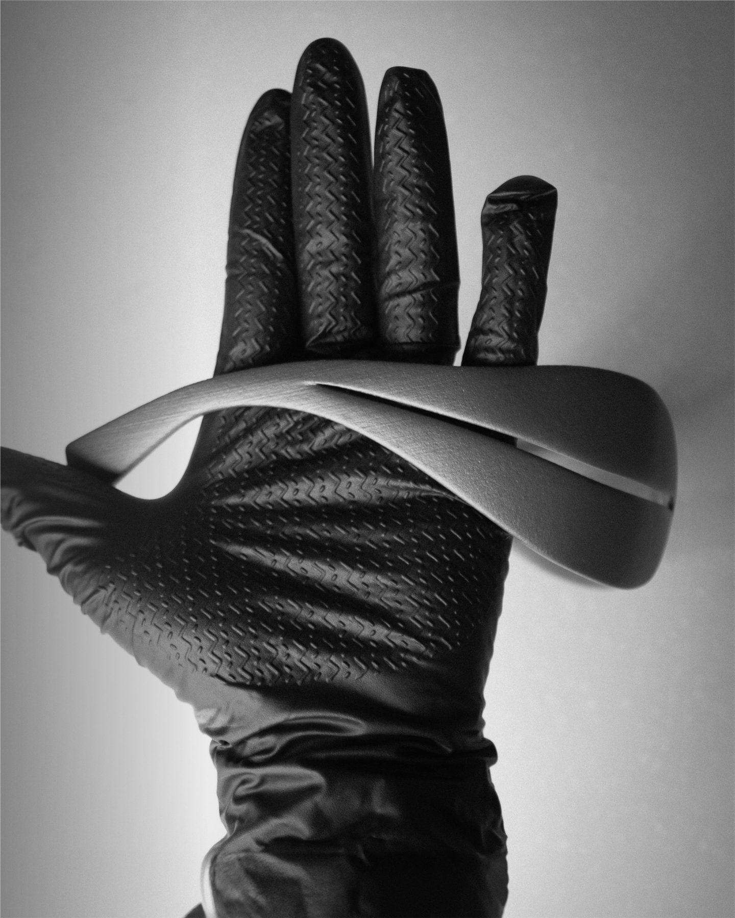
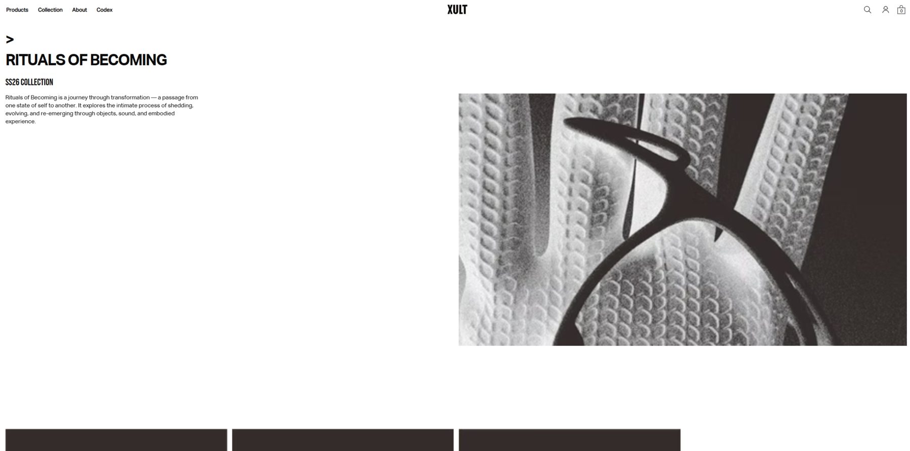
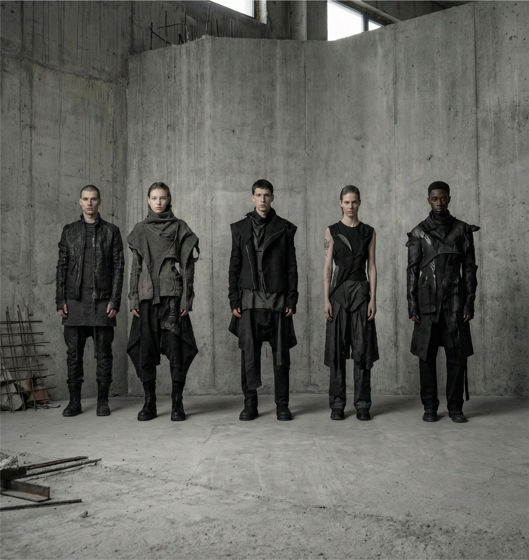
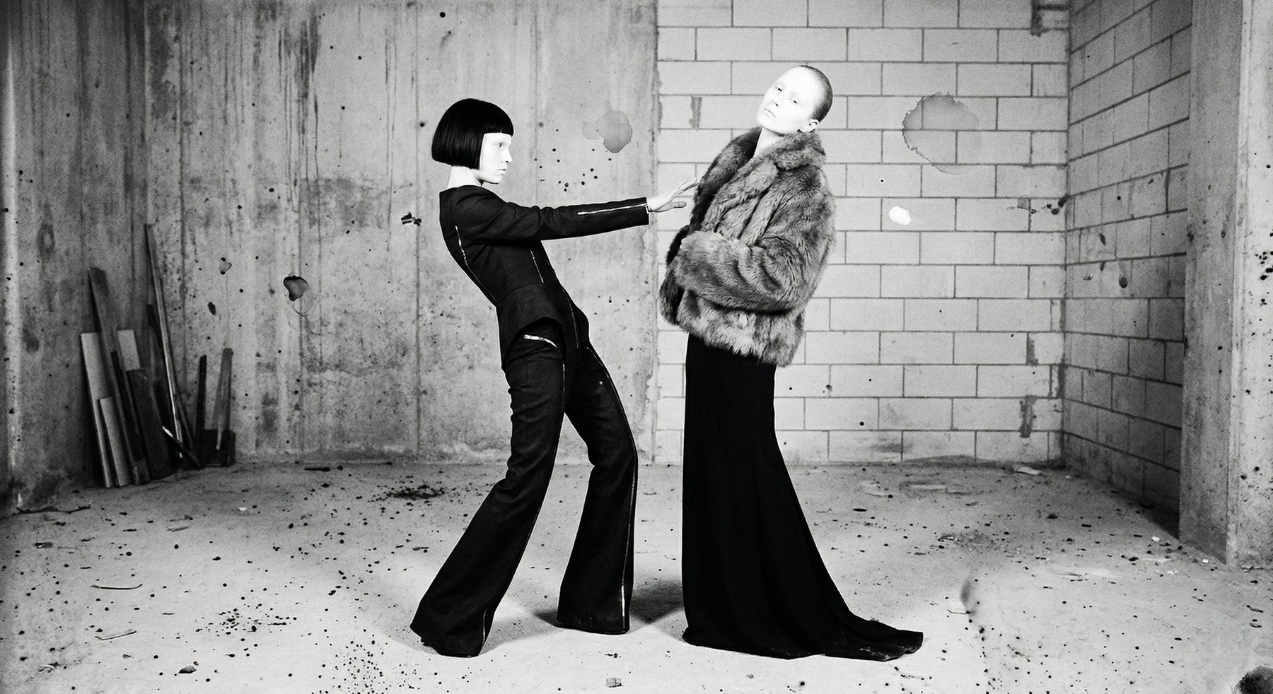
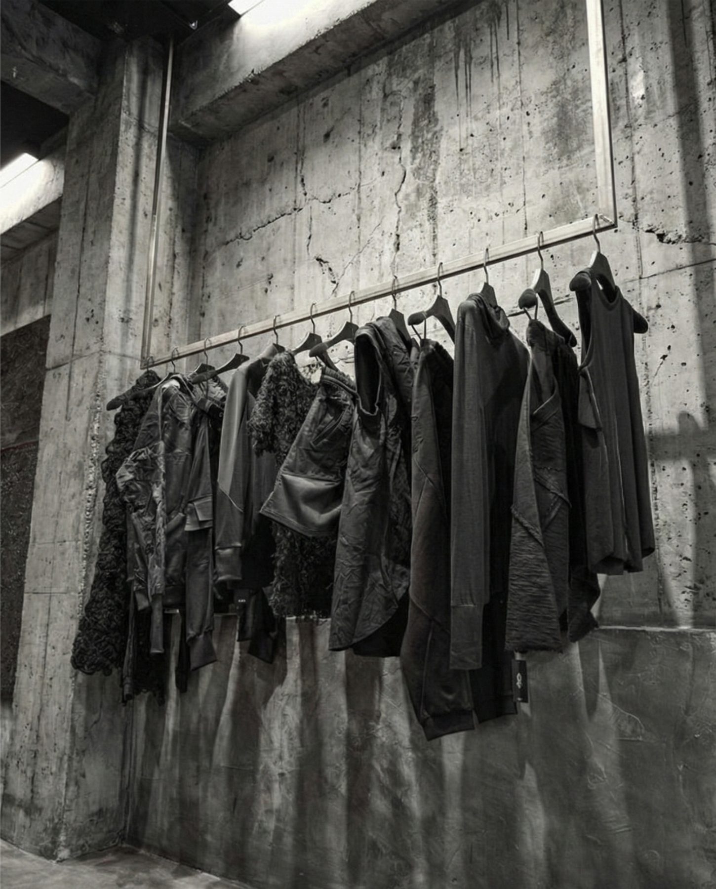
Collection
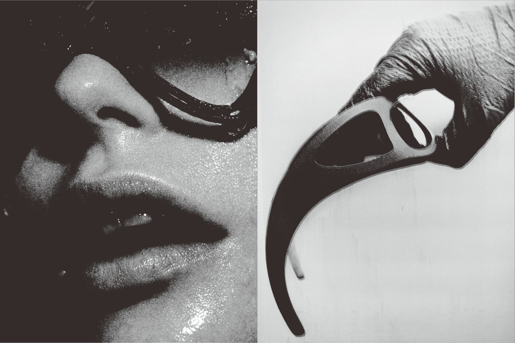
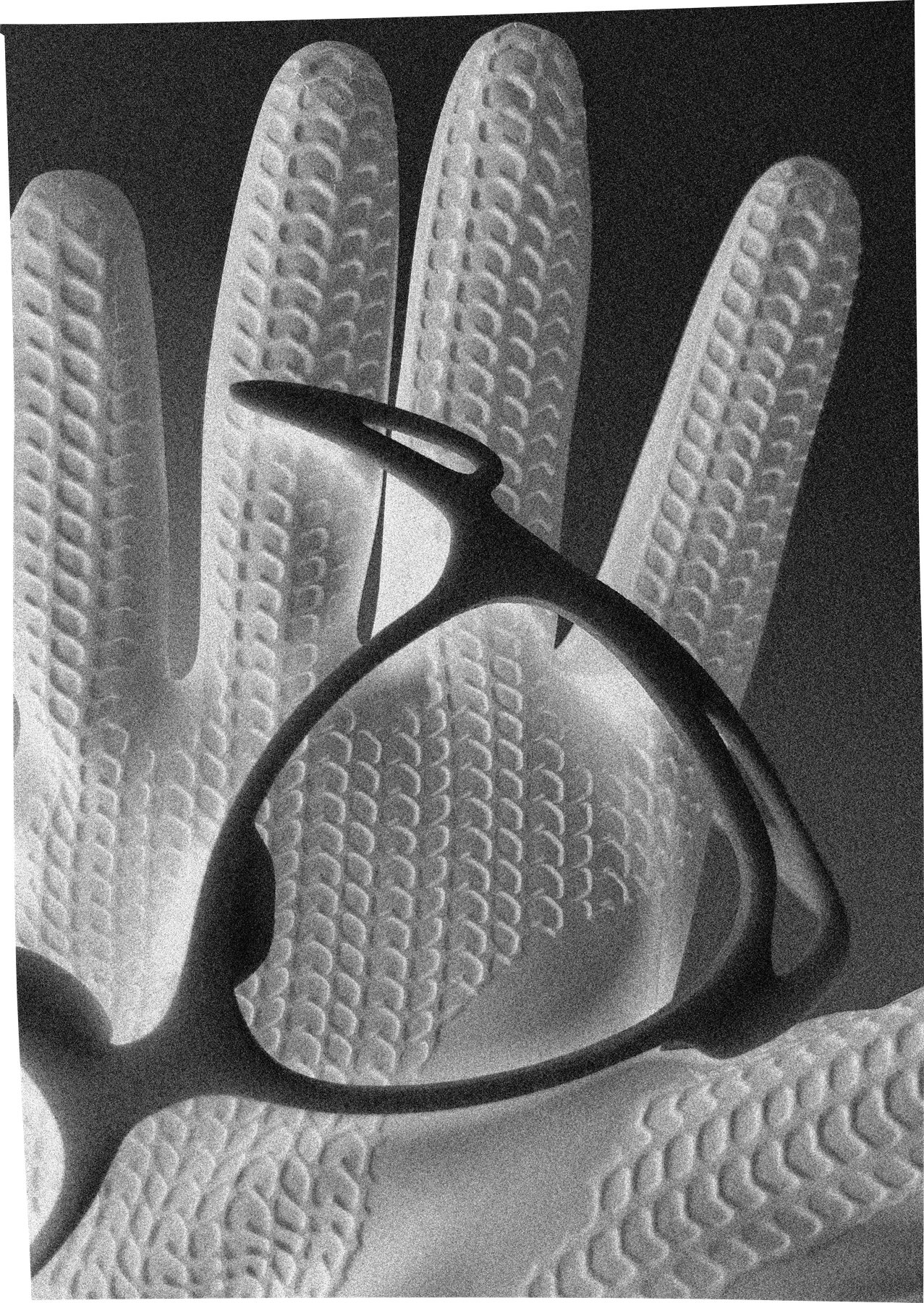
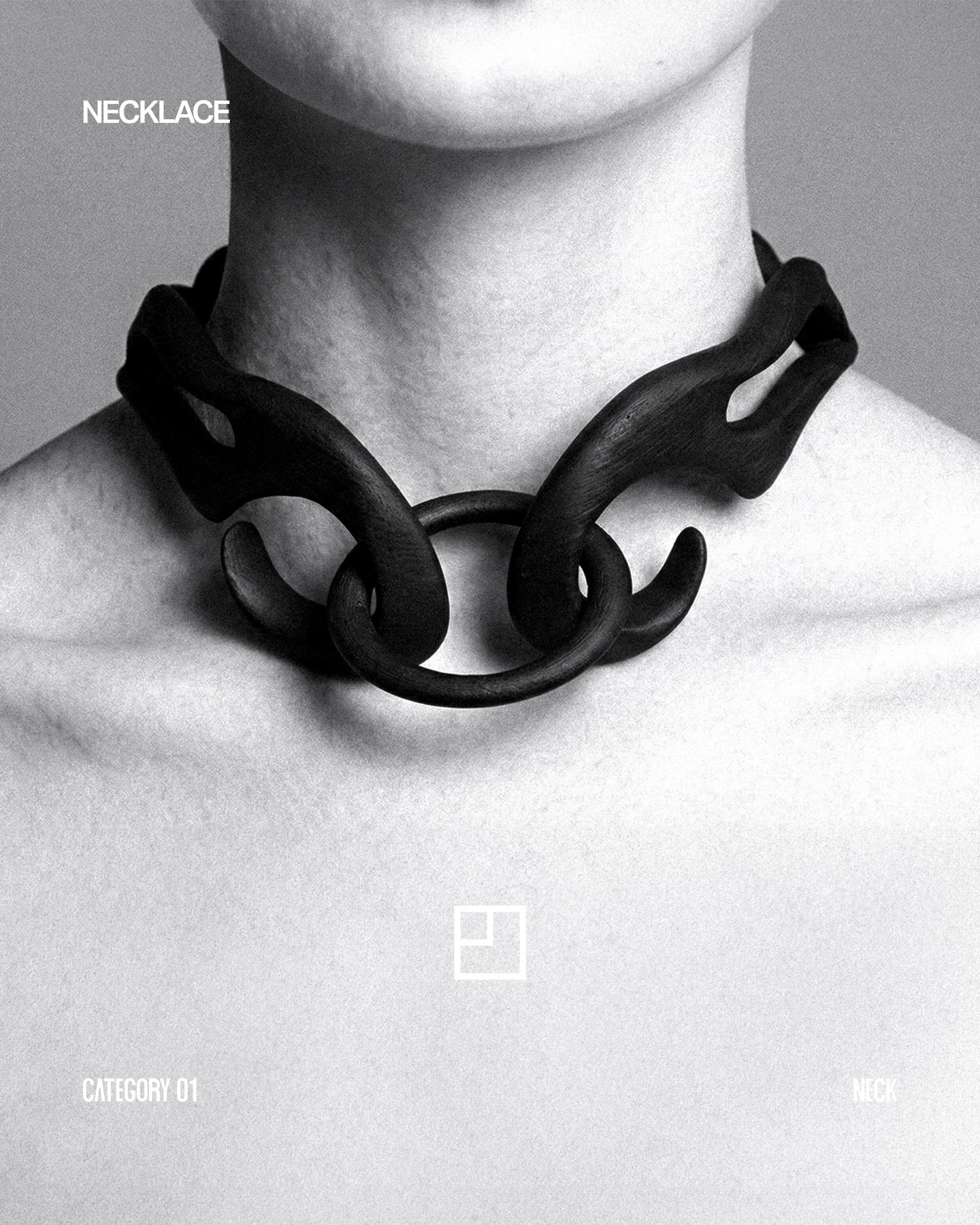
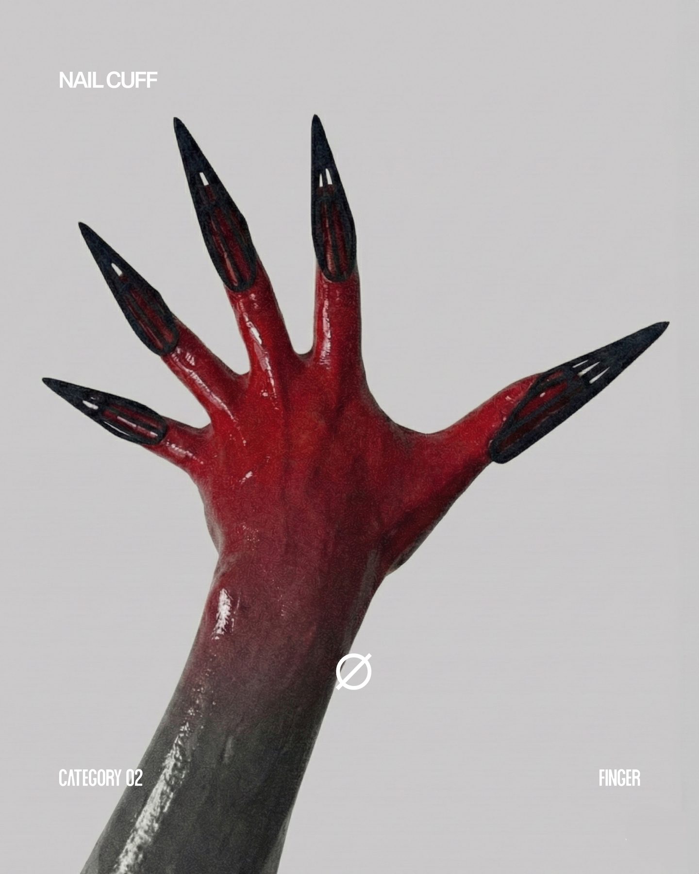
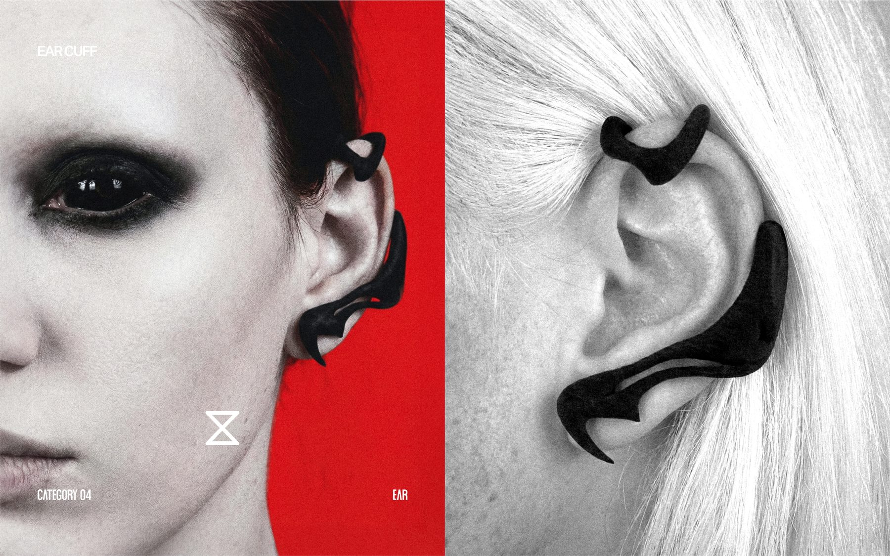
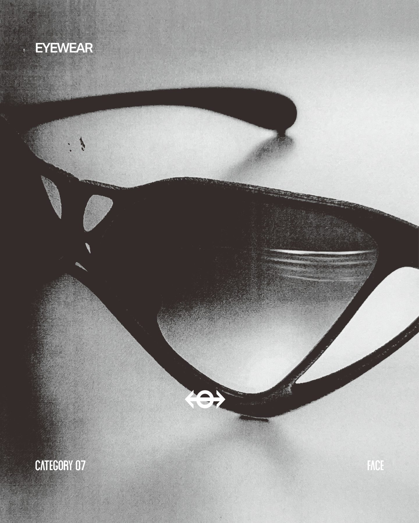
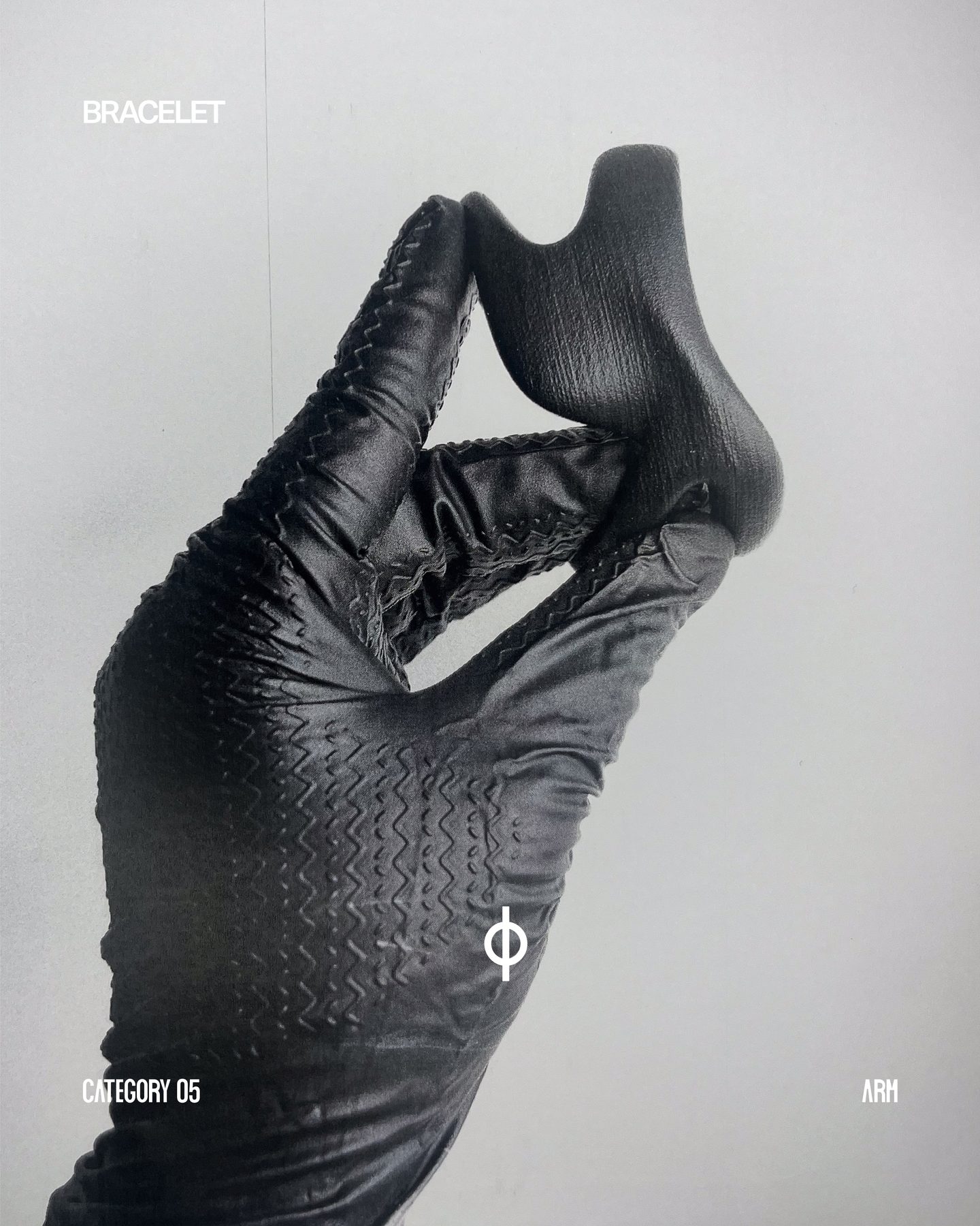
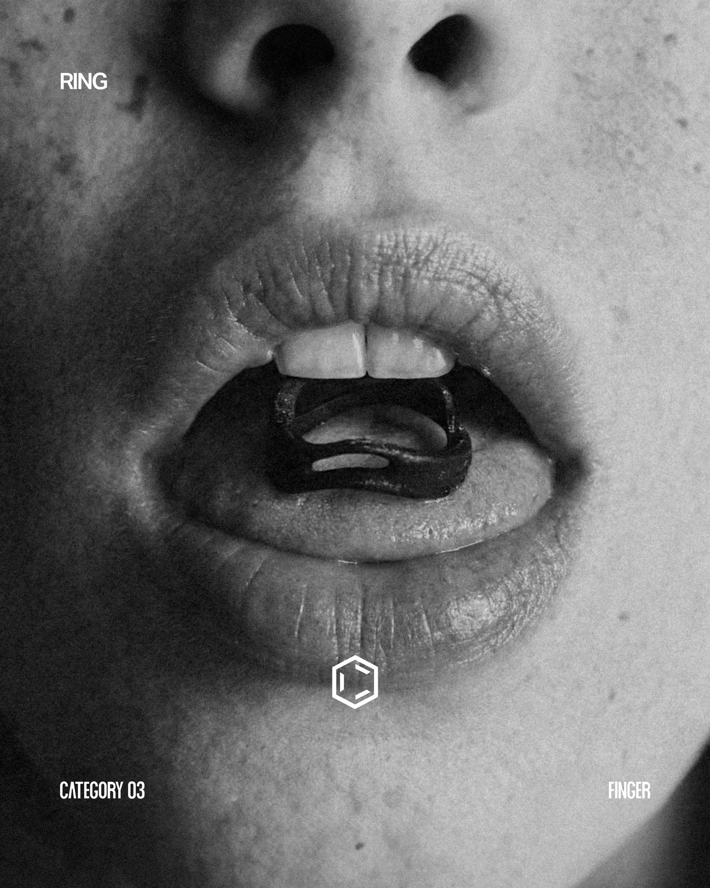
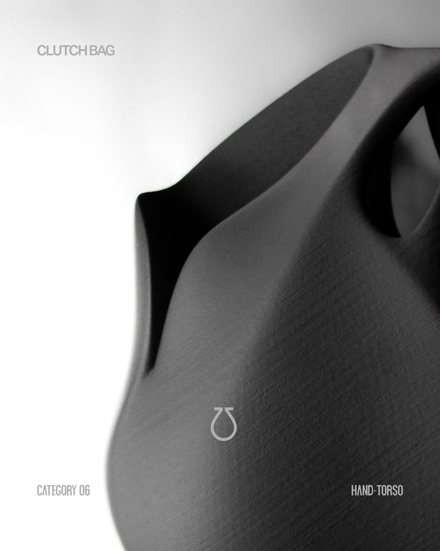
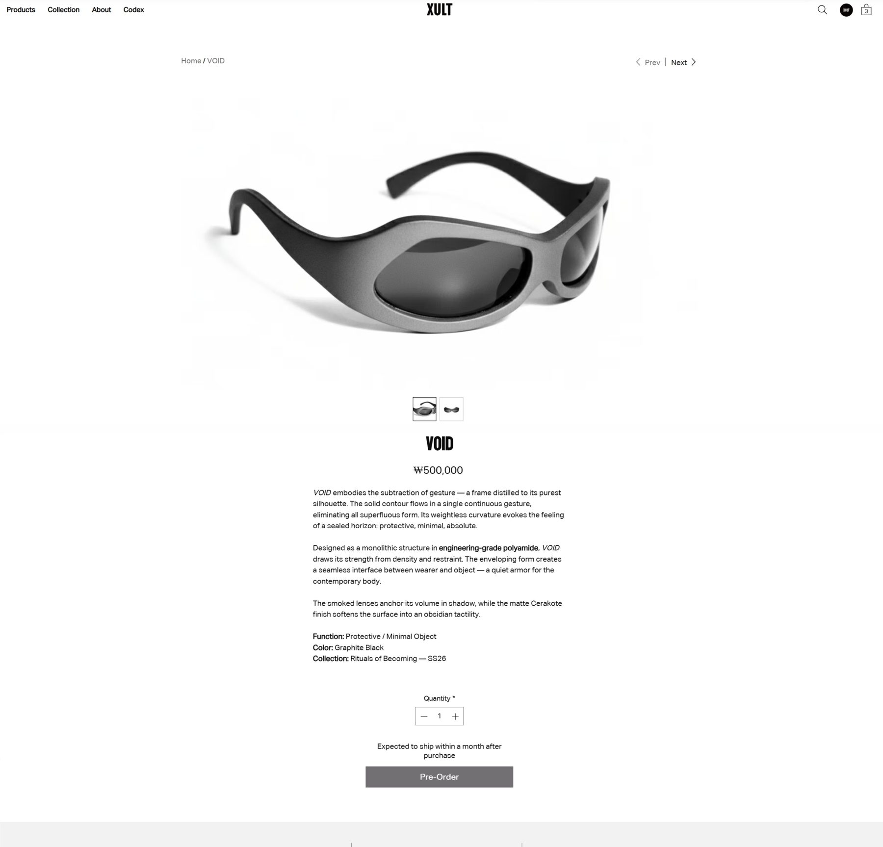
The first collection was developed as a unified product system. Across 25 designs and three colorways, each object follows the same design logic: lightweight skeletal geometries, tension-based silhouettes, and forms derived from the relationship between vision, protection, and identity.
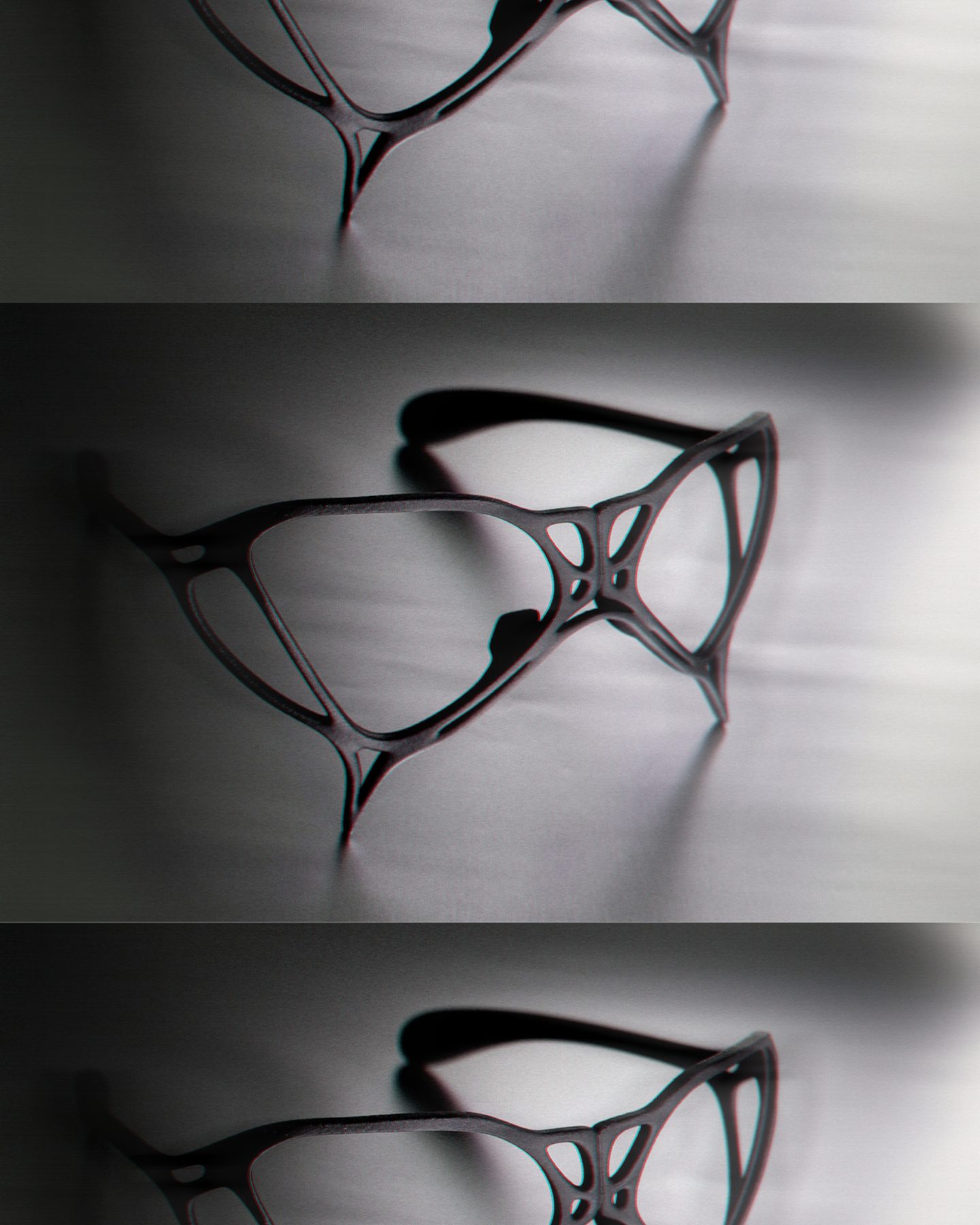
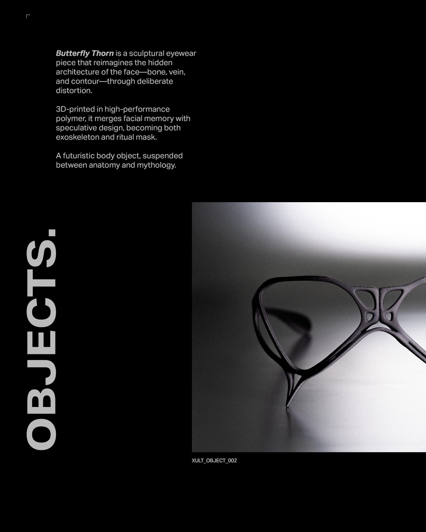
Morphology
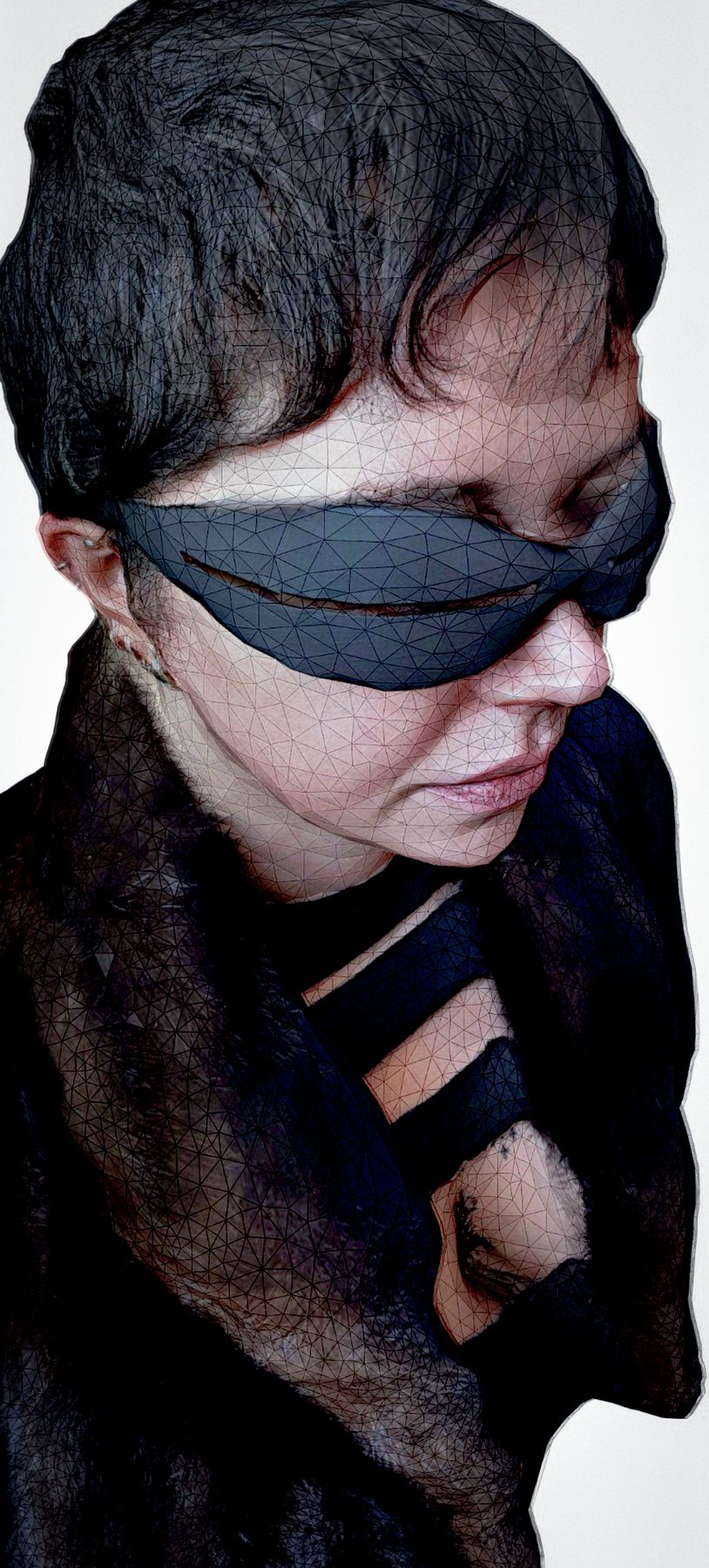
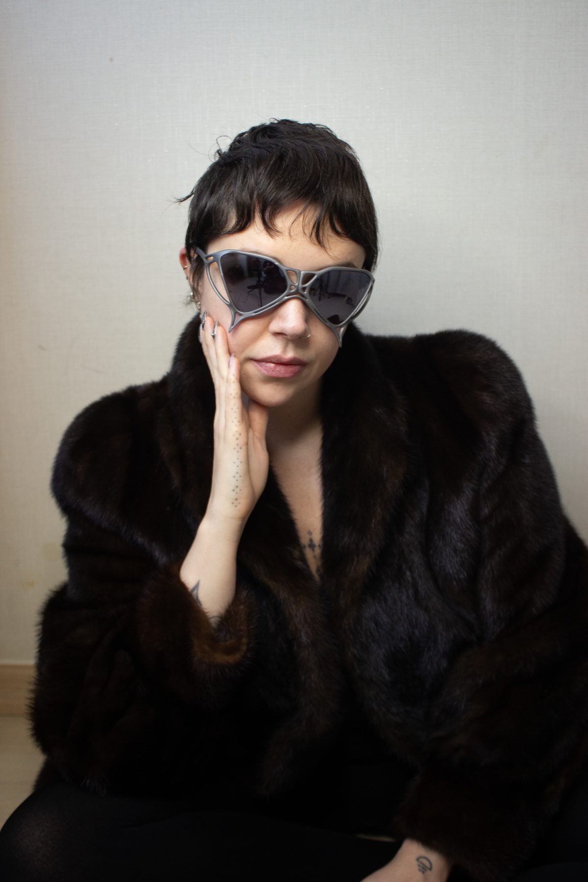
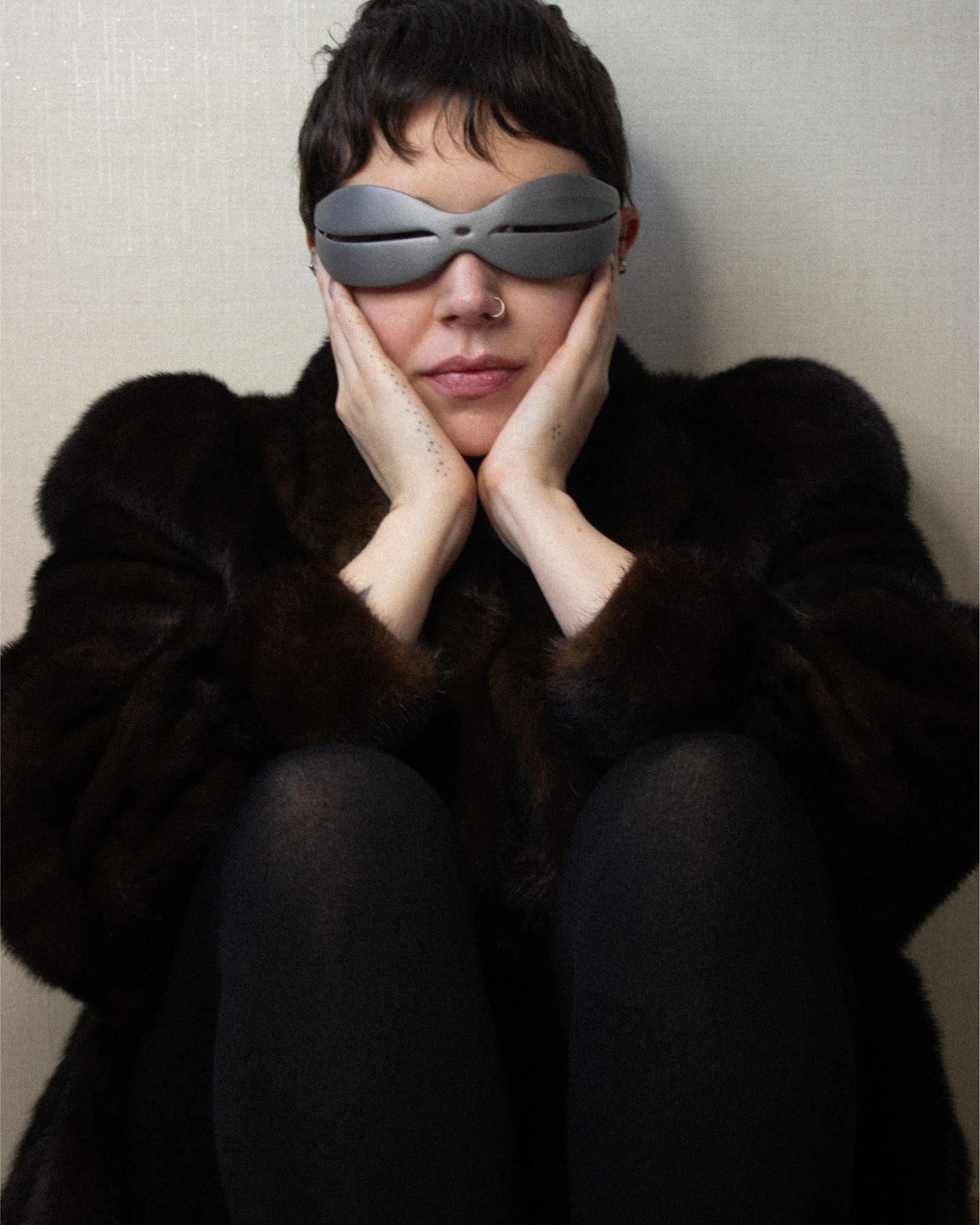
The six eyewear designs — OBLIVION through LUCENT — chart a morphological progression from primal visor to integrated contour, translating the anatomy of bone and muscle into engineered geometry. Beyond eyewear, the system extends into sculptural clutches, necklaces, bracelets, rings, and ear cuffs, each following the same principle of anatomical correspondence.
Material
The ceramic coating removes the visual and tactile association with plastic, creating surfaces that feel closer to stone, bone, or ceramic. Material choice is part of the narrative: synthetic process, organic presence.
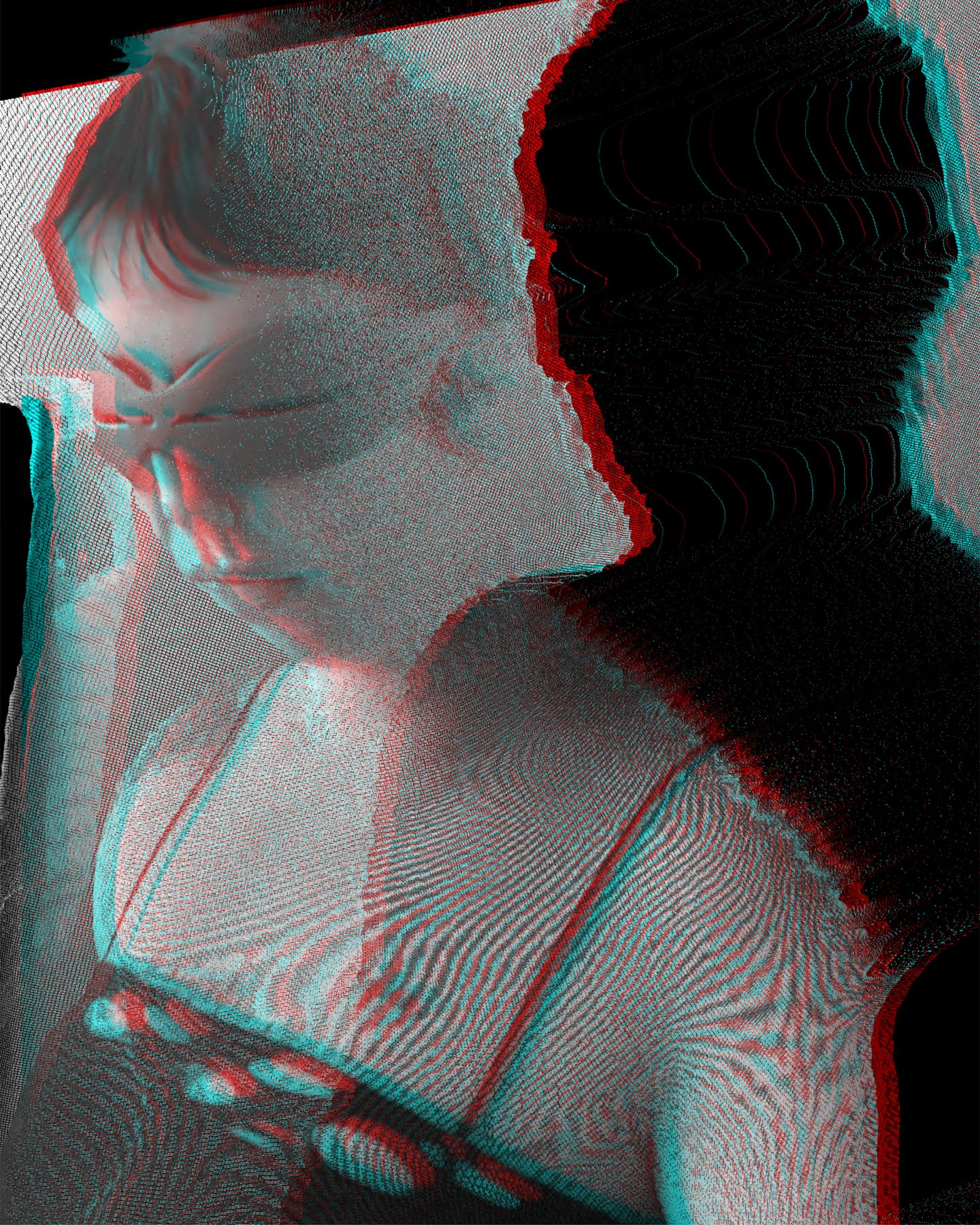
Method
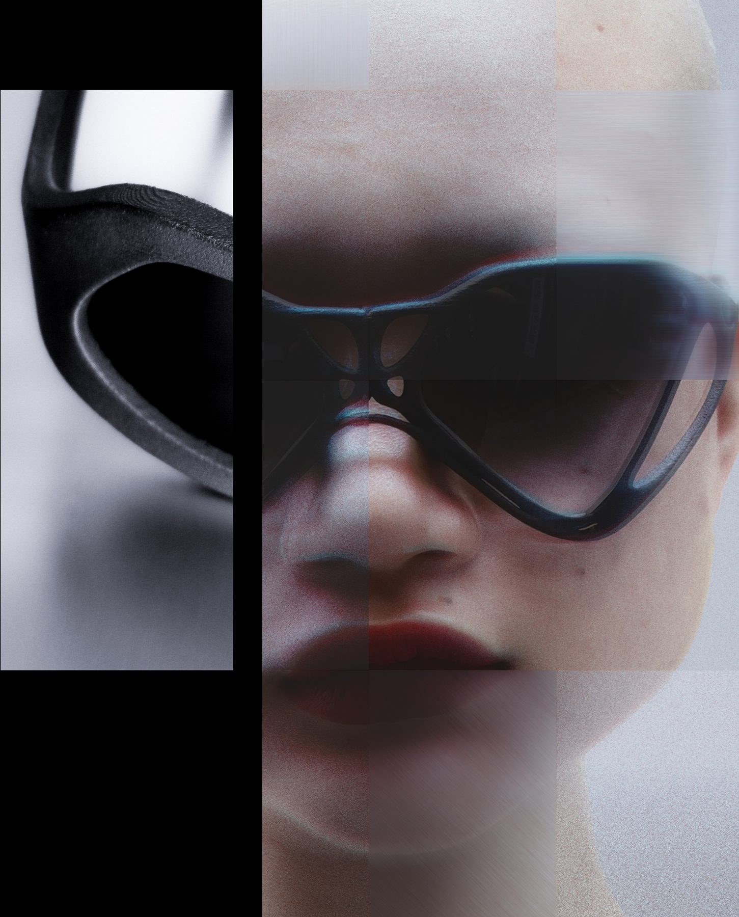
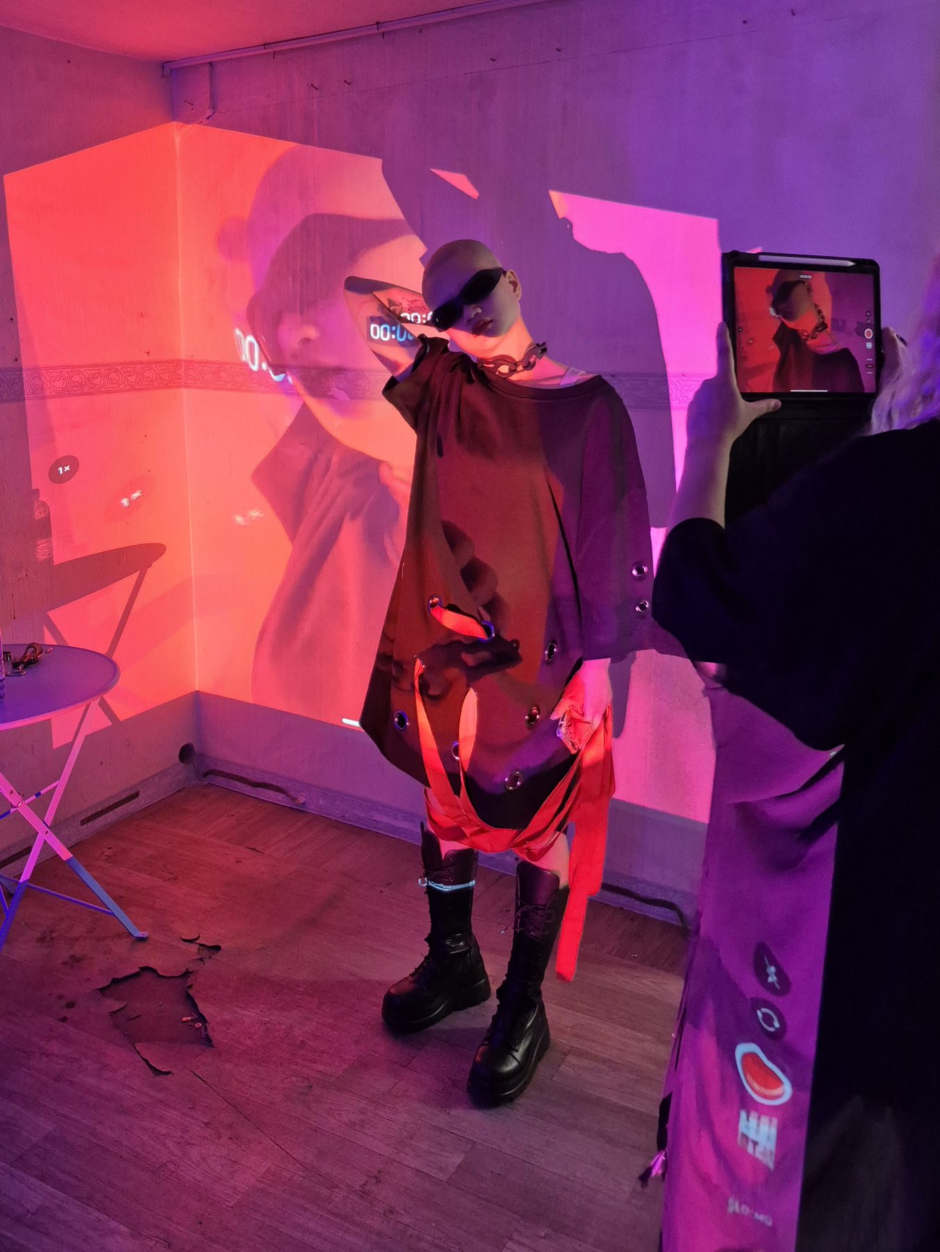
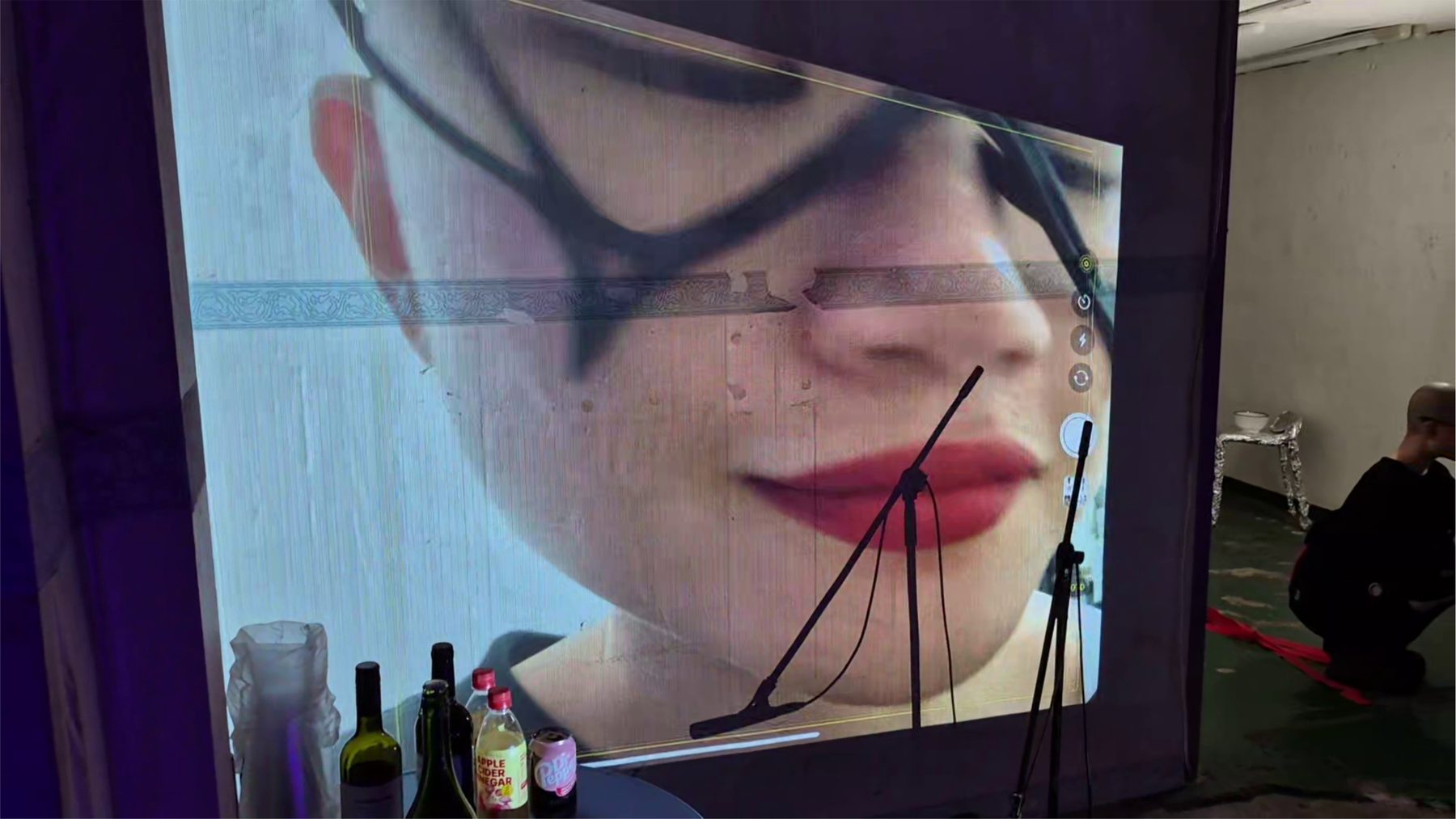
The SS26 campaign treats wearable objects as data, ritual, and extensions of the body. LiDAR imaging and 360° video captures recorded the body from multiple angles; stills extracted from this footage became campaign images. The skin becomes a surface for digital intervention, echoing the construction process behind the objects.
Language
The visual language relies on high-contrast monochromatic imagery with occasional chromatic aberration — referencing the tension between digital file and physical form. Campaign photography avoids fashion advertising conventions, operating closer to forensic documentation: close-up, textural, clinical.
Register
This atmospheric register — between archival record and speculative fiction — is maintained across all touchpoints, producing a consistent felt condition rather than a consistent look.

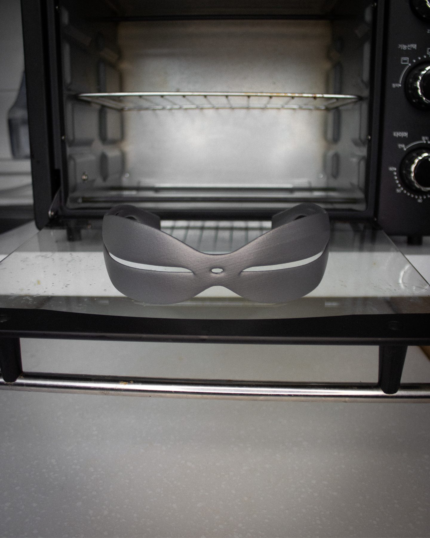
Format
Lab Notes is an ongoing editorial series developed to sustain curiosity without traditional campaign production. With no budget for studios or professional models, the XULT lab became the stage. Objects were photographed in domestic settings placed in slightly surreal situations — inside a refrigerator, in an oven, among tools — creating a sense of magical realism.
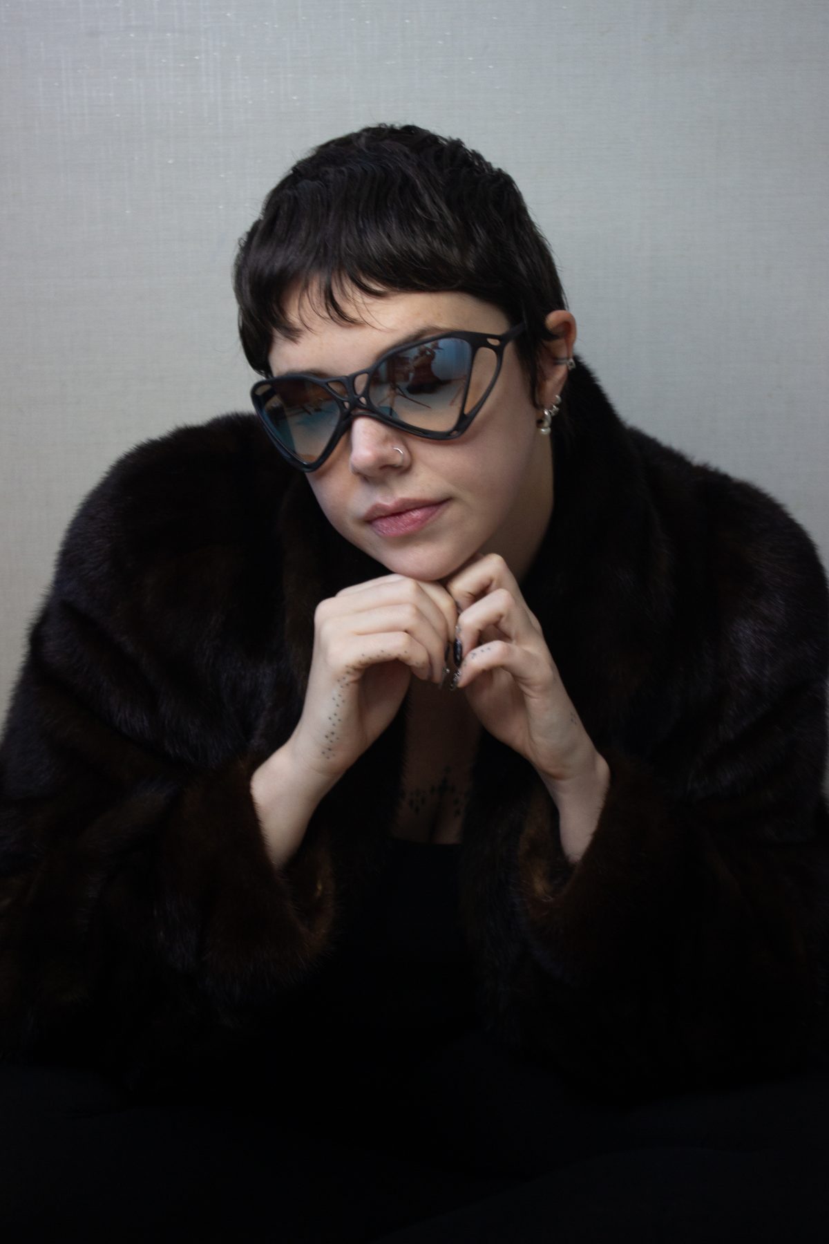
Participant
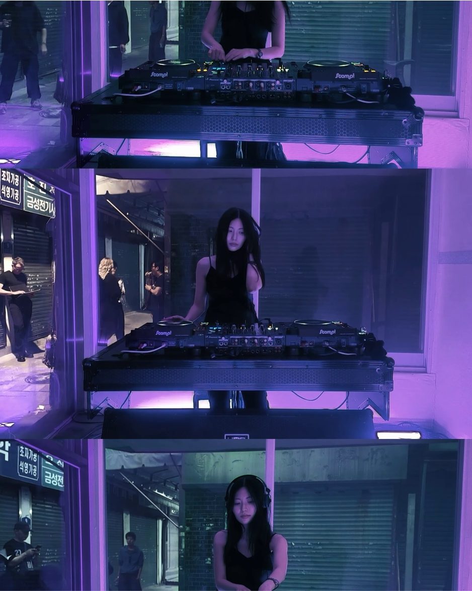
Visitors to the lab — poets, DJs, painters, friends — were invited to wear the objects and be photographed. They were not models but individuals with strong identities, reinforcing the idea that body objects act as extensions of the wearer.
Accumulation
Over time, Lab Notes builds the brand world through fragments rather than explanations — a continuous visual diary where each post functions as a small window into the research environment. The strategy prioritizes texture and accumulation over polished campaign drops.
Platform
The website was conceived as a brand platform where commerce, collection narrative, and theoretical context coexist within a single navigable system. Rather than separating shopping from storytelling, the interface allows visitors to move fluidly between products, collection concept, brand philosophy, and a theory section (Codex).
Interface
A familiar navigation structure keeps the experience intuitive while the visual direction carries the experimental tone of the brand. Standard e-commerce patterns maintain usability; imagery, typography, and layout communicate the sculptural and material nature of the objects.
Integration
The result is a digital brand system where shopping, storytelling, and philosophy operate together — not a secondary channel but a sovereign domain with its own logic, shaped by platform constraints while maintaining atmospheric coherence with the larger system.
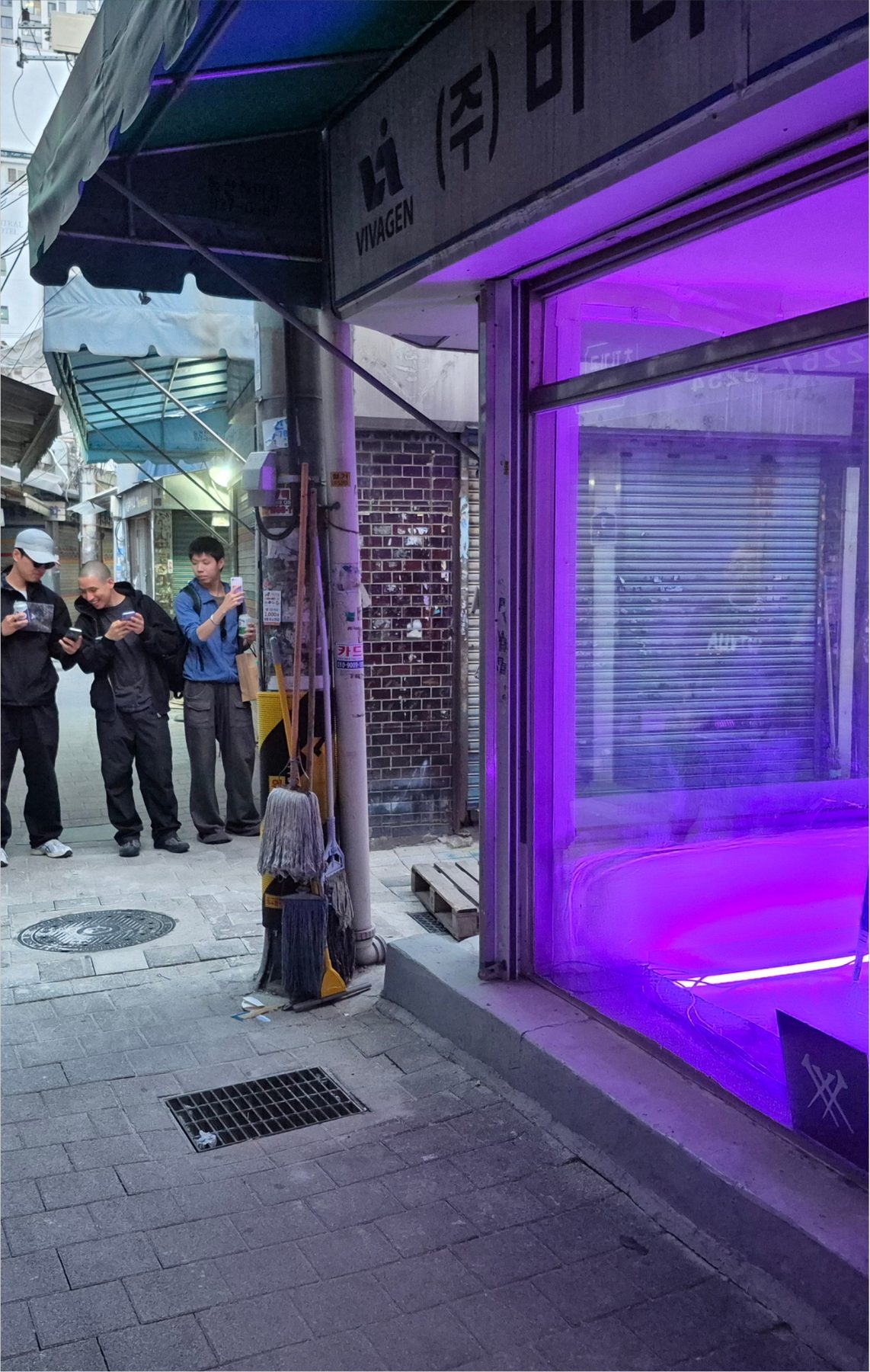
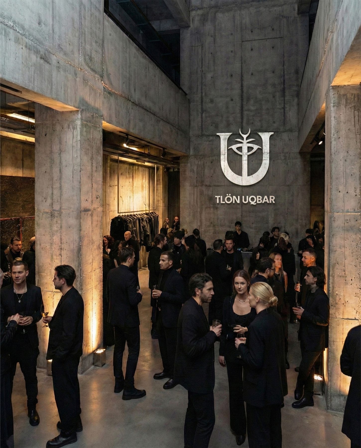
Event
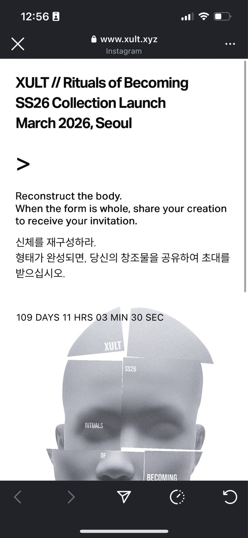
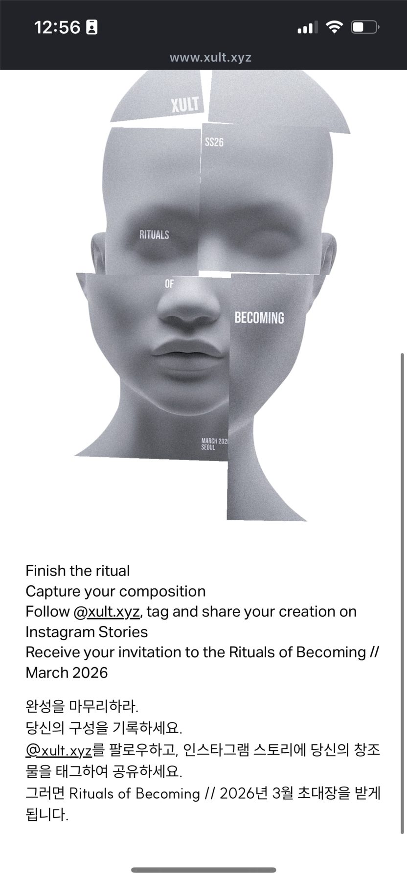
The Cheonggyecheon soft-launch was designed as a spatial experience rather than a product presentation. The event extended the brand's atmospheric logic into a physical gathering — treating the launch as an invitation to enter the world of XULT rather than a retail moment.
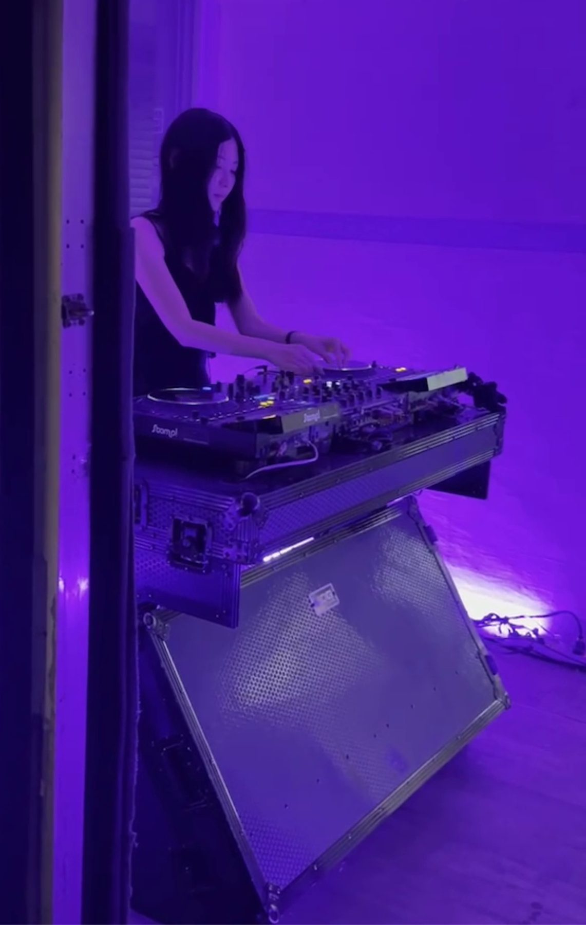
Principle
The spatial design applied the same principles that govern the brand's other systems: restraint, material specificity, and atmospheric coherence. The goal was to create a threshold condition where visitors could experience the objects in their intended context — close to the body, embedded in ritual, charged with the tension between ancient form and digital process.
Coherence
Space, like packaging, typography, and product, carries the brand's affective signature. Every touchpoint produces the same felt condition — not through visual repetition, but through atmospheric correspondence.
A Brand Born from Fiction
Tlön Uqbar is a fictional fashion house inspired by Jorge Luis Borges' literary universe — a brand that exists not to sell garments, but to construct a world. Every design decision serves the fiction: typography, symbols, materials, and space behave as if recovered from an alternate civilization rather than produced for a market.

Worldbuilding as Design Method
The project treats brand identity as speculative worldbuilding. Rather than starting from consumer positioning or trend analysis, Tlön Uqbar begins with a mythology — then asks what a fashion house emerging from that mythology would look, feel, and behave like.
Designing Across Domains
The brand operates across graphic identity, packaging, campaign imagery, and physical space, with each domain functioning as a different entry point into the same fictional reality. Coherence comes not from visual repetition but from a shared atmospheric condition that runs through every touchpoint.

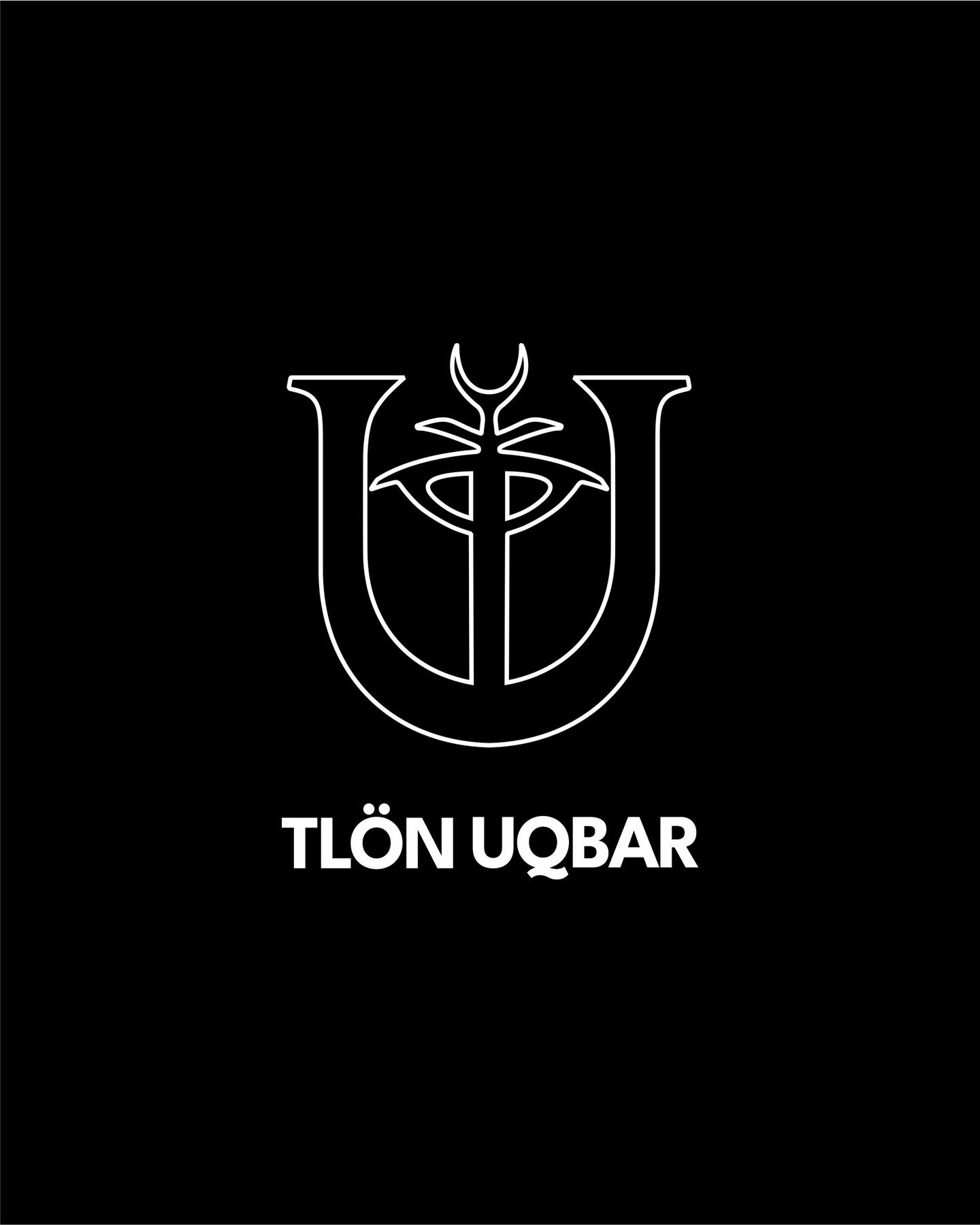
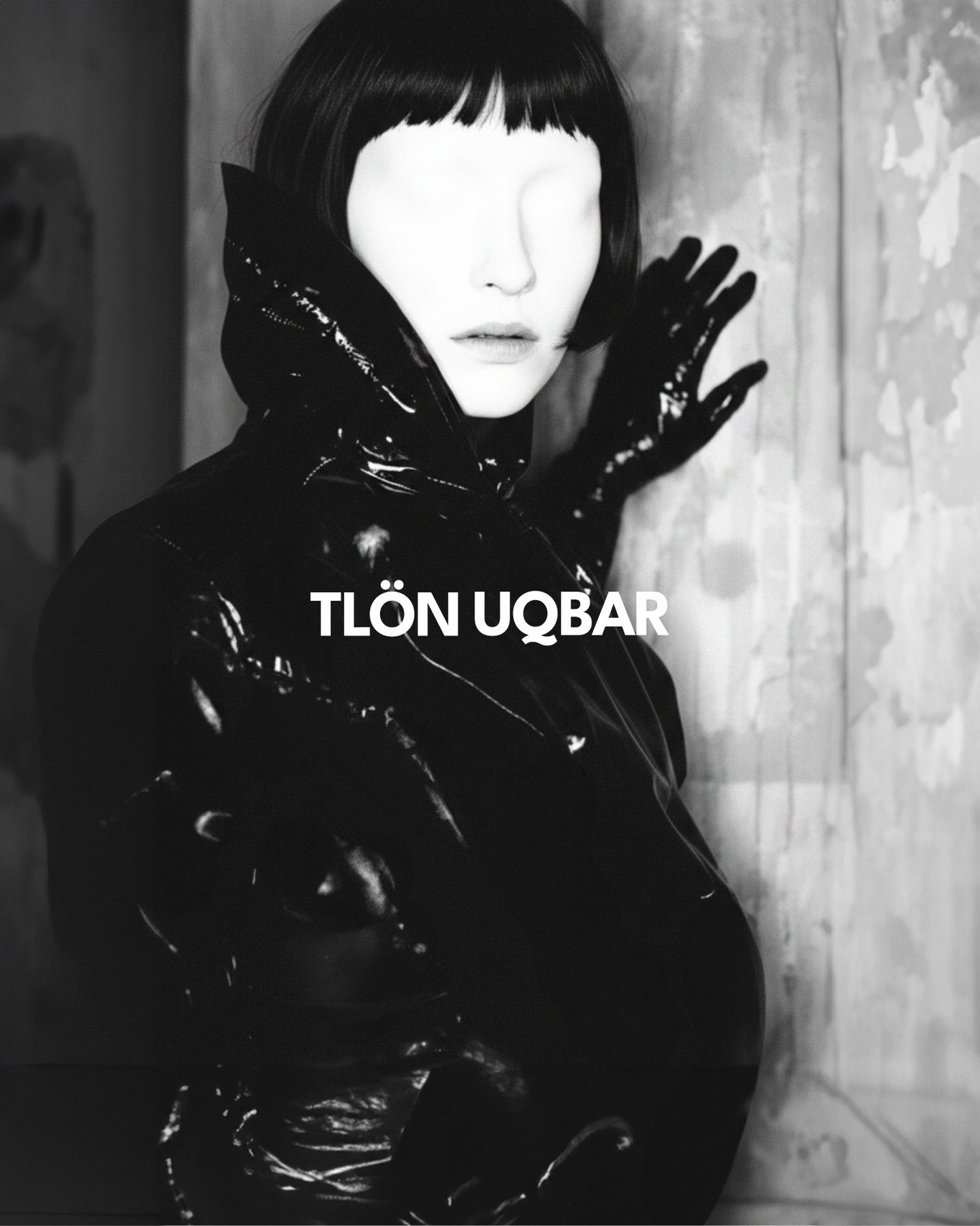
Identity as Artifact
Tlön Uqbar's visual identity avoids contemporary fashion codes entirely. The logo behaves as a mark of origin rather than a commercial signature — closer to a seal or an imprint than a brand mark. Typography, stationery, and printed matter adopt a coded, monochrome language that feels archival rather than designed.
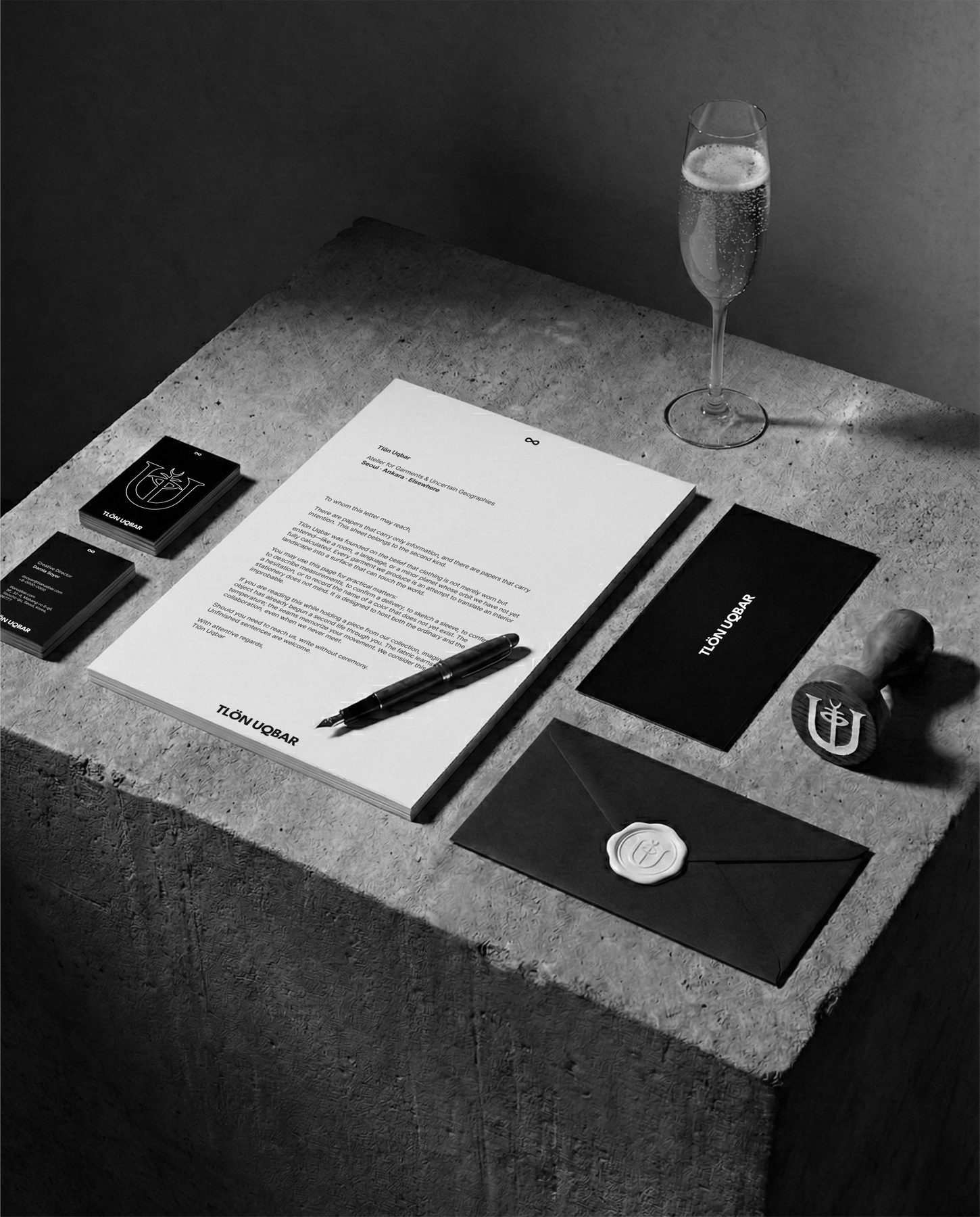
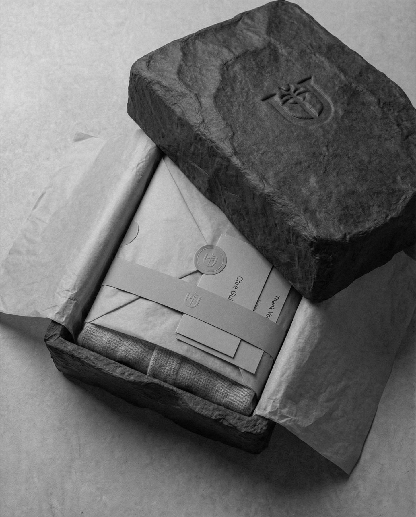
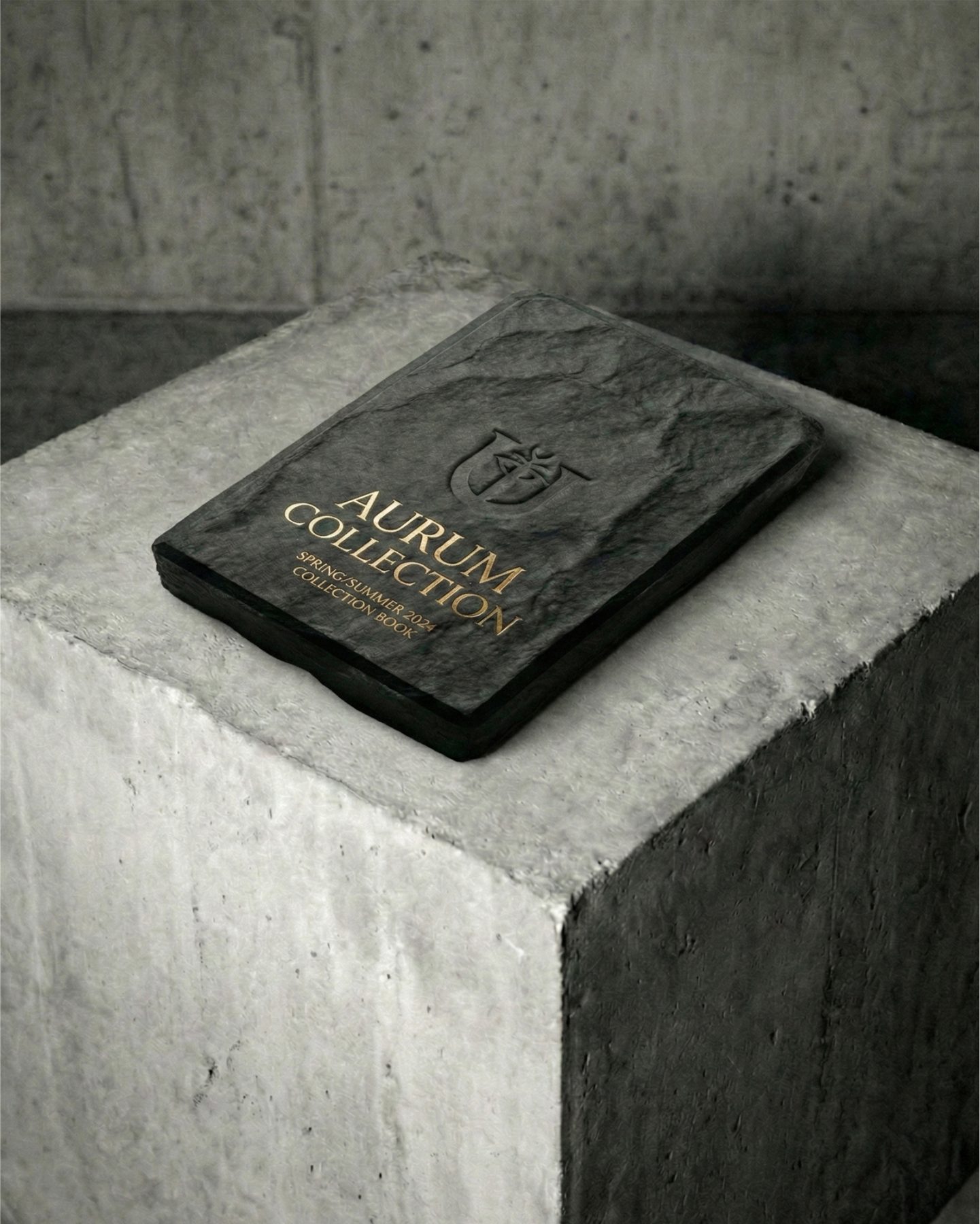
Packaging as Preservation
The packaging system treats garments as objects to be catalogued and preserved, not displayed. Wrapped in raw, stone-like materials, each piece feels discovered rather than purchased — as if it had been excavated from a site rather than shipped from a warehouse.
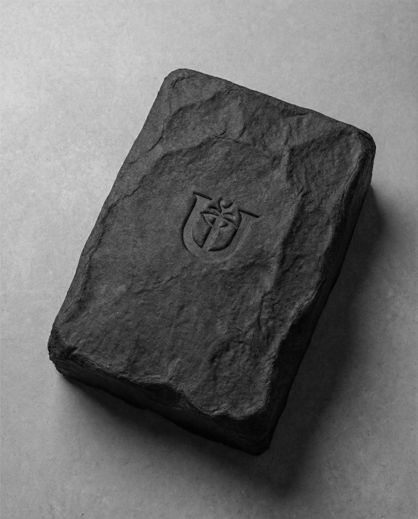
Material Language
Stone, imprint, ritual, and permanence are the governing material references. Every physical element communicates mythology and material presence before commerce, positioning Tlön Uqbar as a house existing between literature and reality.
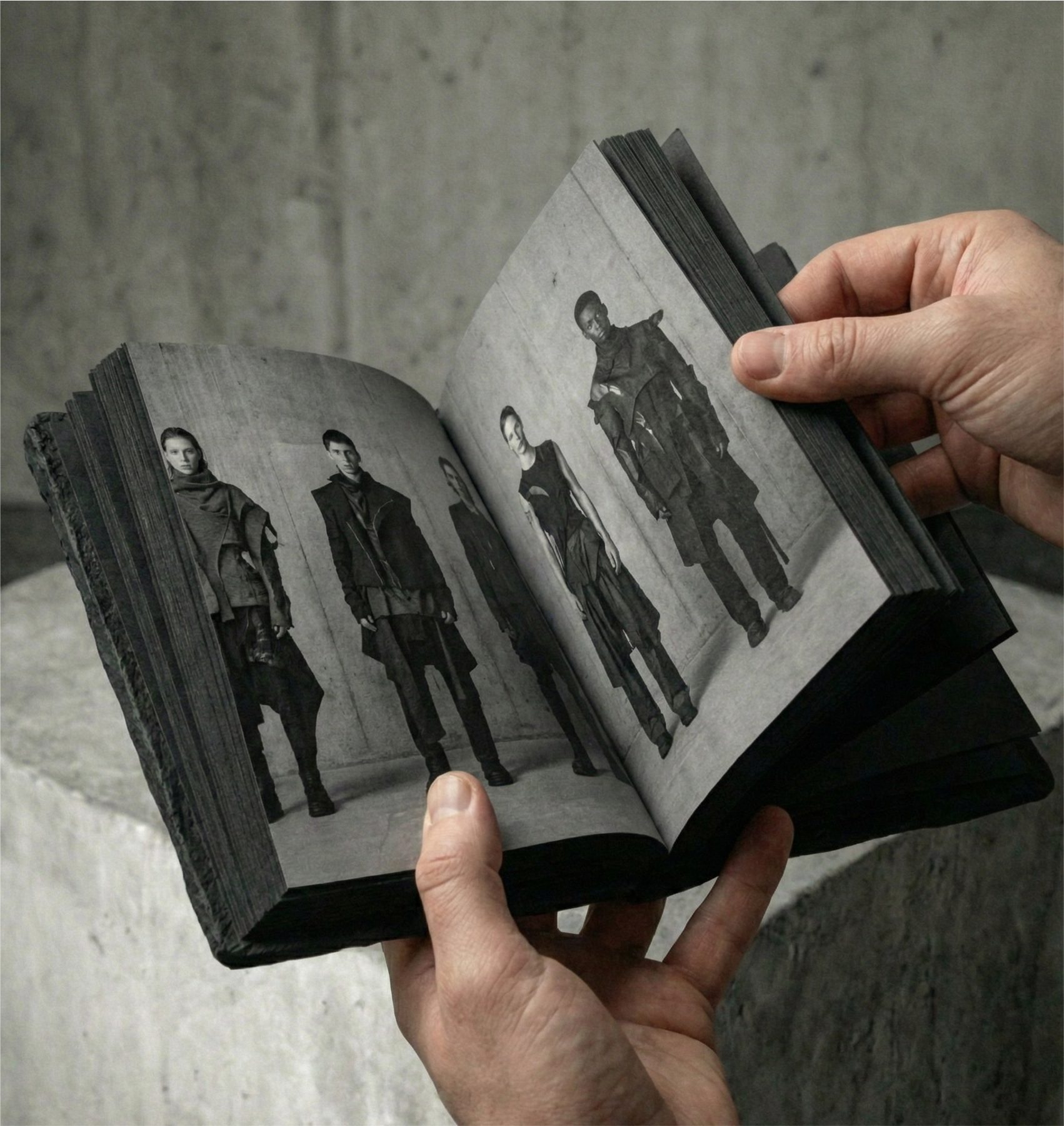
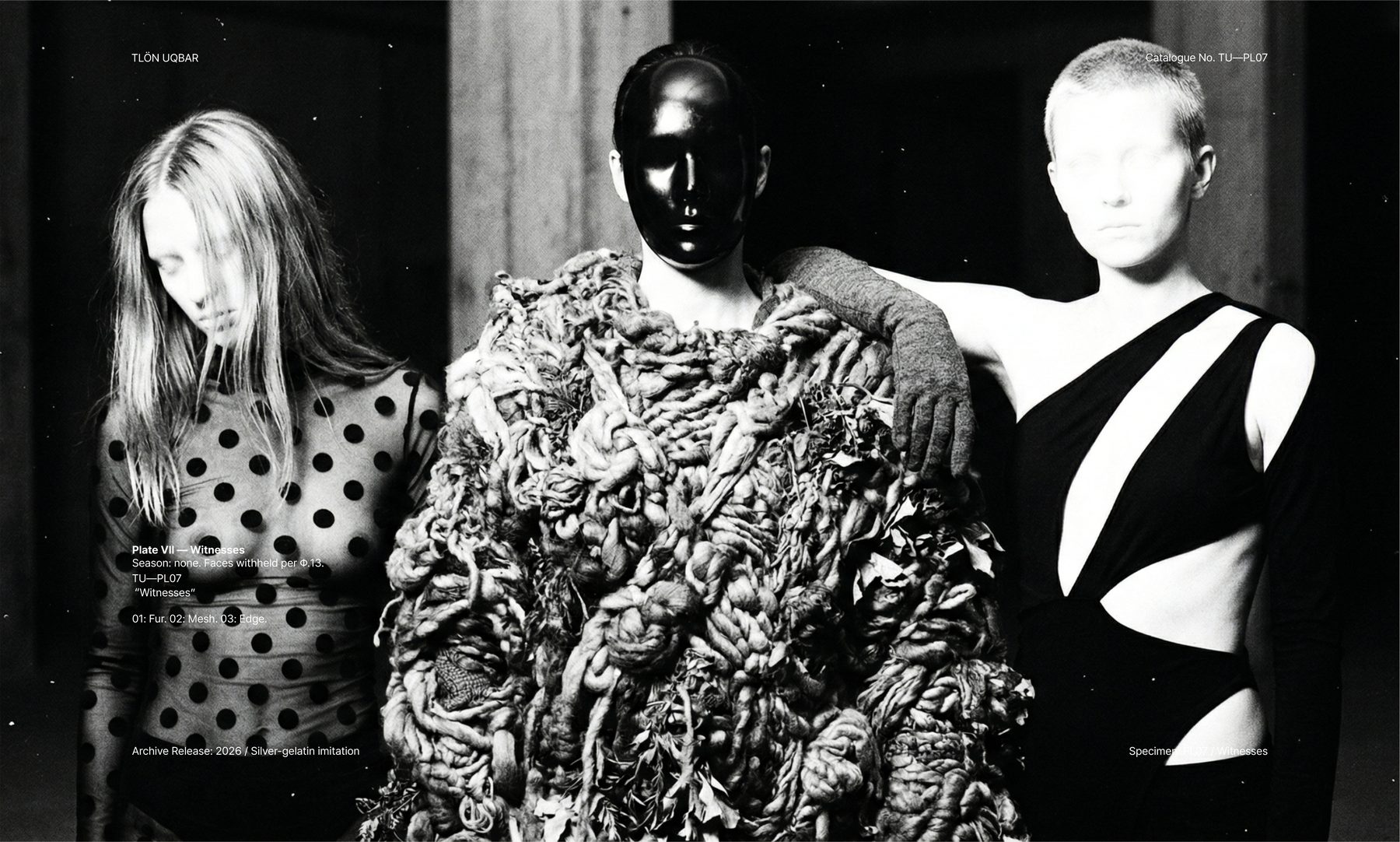
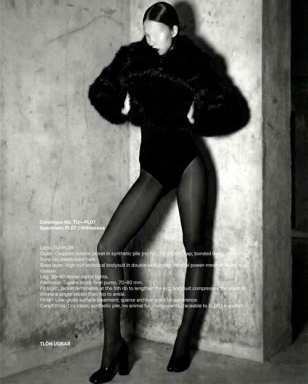
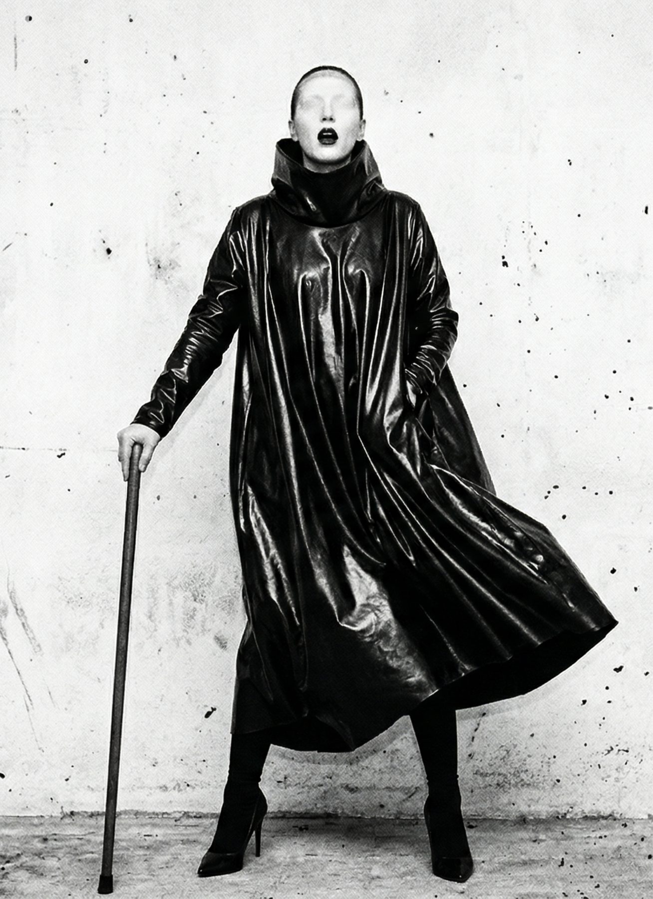
Documentary Evidence
The campaign images are presented as visual records from the universe of Tlön Uqbar, not as a conventional fashion shoot. Garments, symbols, and figures appear as if discovered rather than styled — existing within a quiet, alternate logic where clothing functions as cultural artifact.
Constructed Through Systems
Rather than directing a traditional photographic campaign, the visuals were built through generative image systems guided by precise art direction and iterative control. Each frame was treated as archival documentation, with composition, texture, lighting, and posture deliberately shaped to evoke fragments from a larger fictional history.
A World Slightly Adjacent
The absence of overt identity cues, the restrained palette, and the stark environments reinforce the sensation that these scenes belong to a reality running parallel to ours. The result is a body of imagery that feels less like branding and more like evidence of a place that may have always existed alongside our own.
Space as Narrative Medium
In Tlön Uqbar, physical space is not a backdrop for garments — it is the primary medium through which the fiction becomes inhabitable. Environments are constructed as atmospheric installations where visitors move through a narrative world rather than a retail or runway format.
Materiality and Ritual
Raw concrete, controlled lighting, symbolic markings, sound, and material presence create settings closer to an archaeological site or a philosophical archive than a fashion event. The logo appears embedded in the architecture itself, functioning as a mark of origin rather than applied branding.
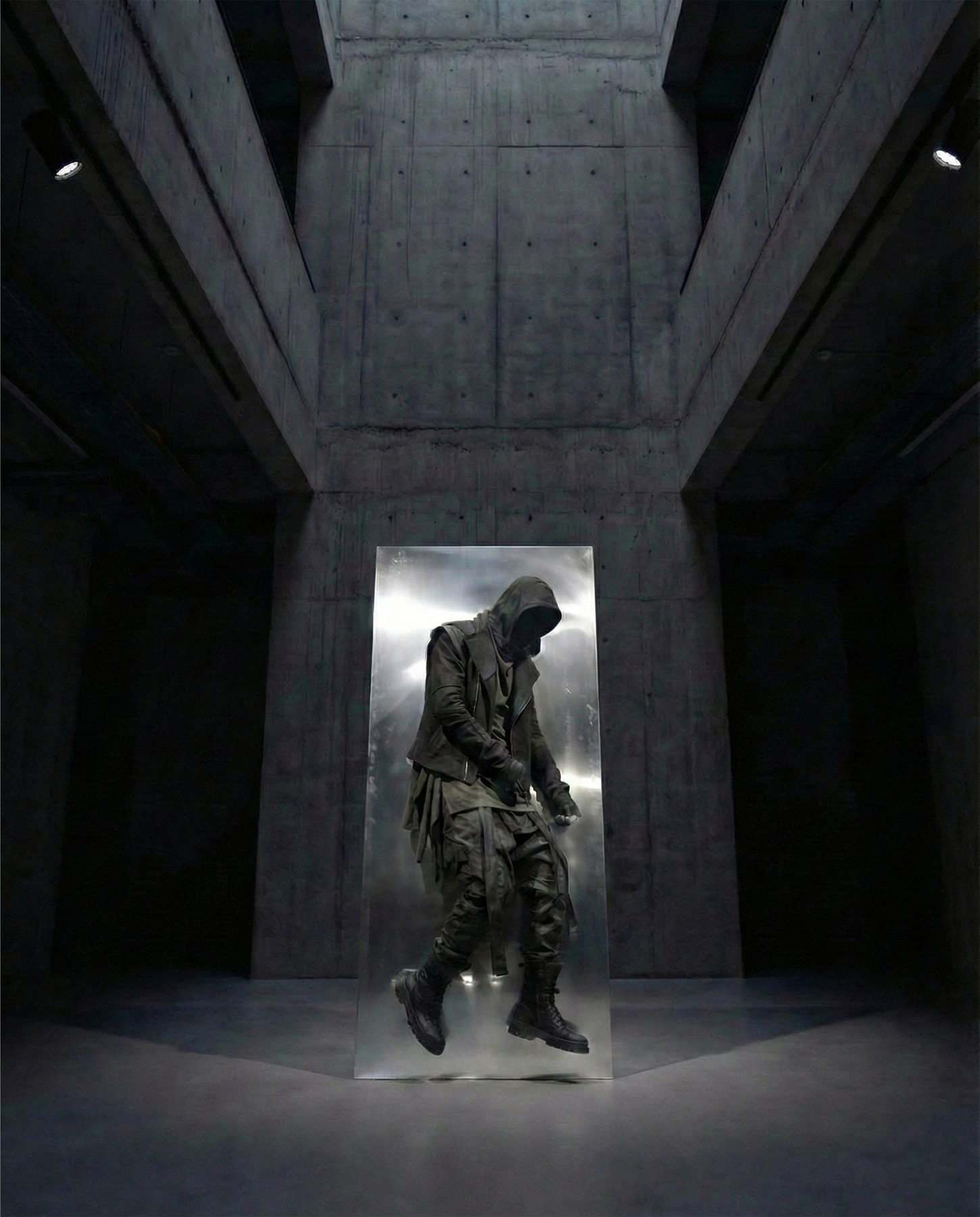
Space Becomes the Brand
This spatial language allows Tlön Uqbar to communicate its identity through direct experience. Garments hang like specimens, sound becomes atmosphere, and visitors become participants inside the fiction — a launch environment where space itself becomes the brand.
A Brand Between Geographies
NAR is a fictional fashion house that treats garments as passages between places, materials, and traditions. Rooted in Anatolian material culture and contemporary design thinking, the brand exists between cities, between craft and industry, and between memory and modern form.

Heritage as Living System
Rather than quoting tradition nostalgically, NAR reinterprets cultural artifacts — carpets, leather craft, agricultural symbols, rural material life — into a modern visual language. The garments, objects, and packaging reference heritage while positioning it as something evolving rather than preserved under glass.
Material Before Graphics
NAR builds its brand world from physical reality outward. Carpets, wood, leather, fruit, and landscape are not backdrops but core elements of the visual system, grounding every design decision in tactile, geographic specificity before any graphic layer is applied.
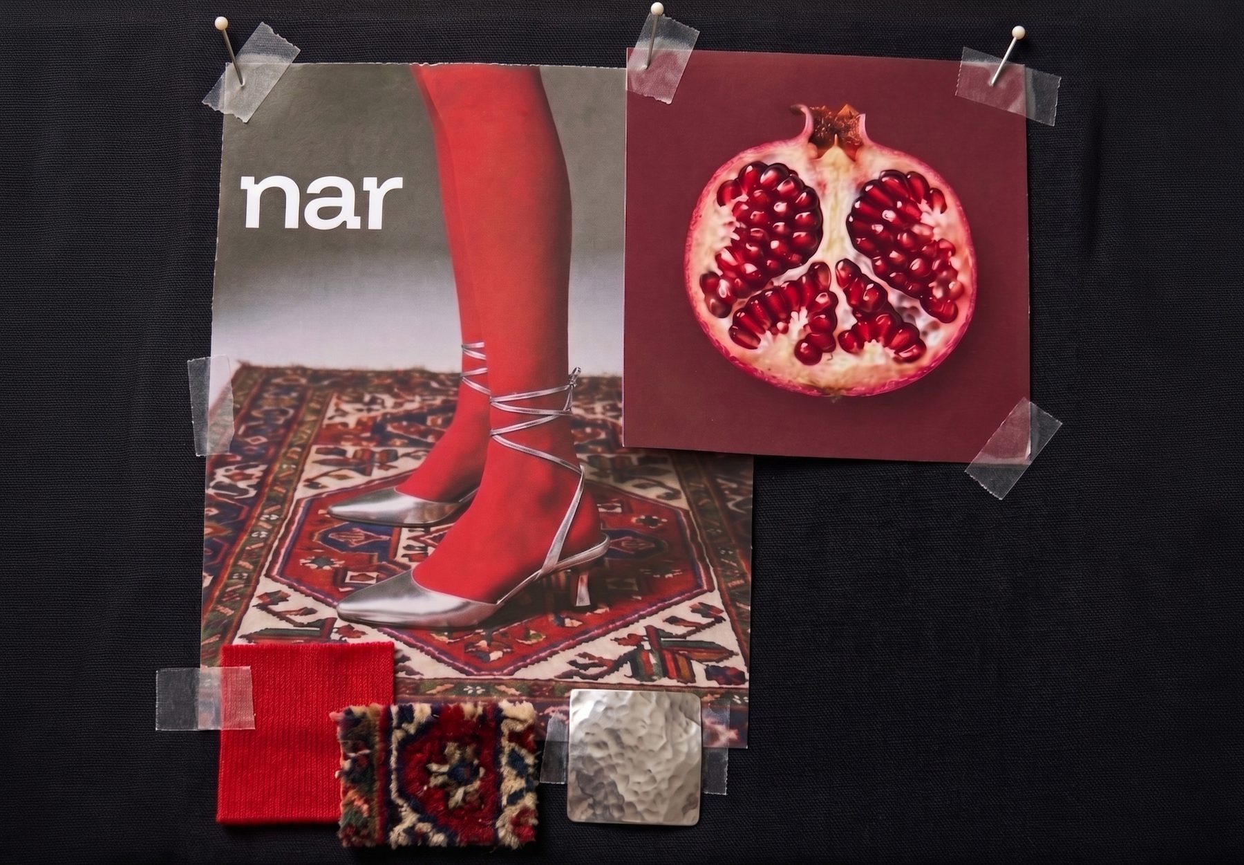
Symbol as Inheritance
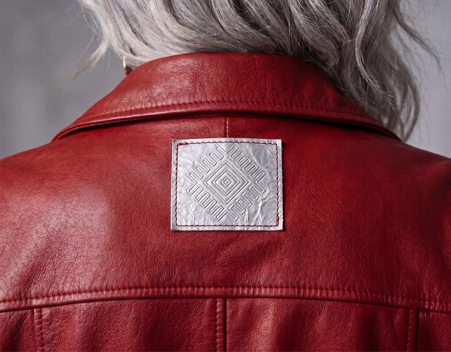
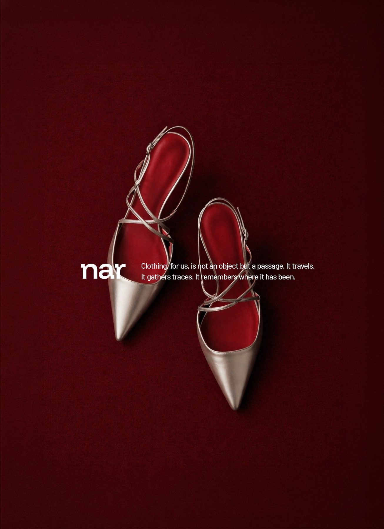
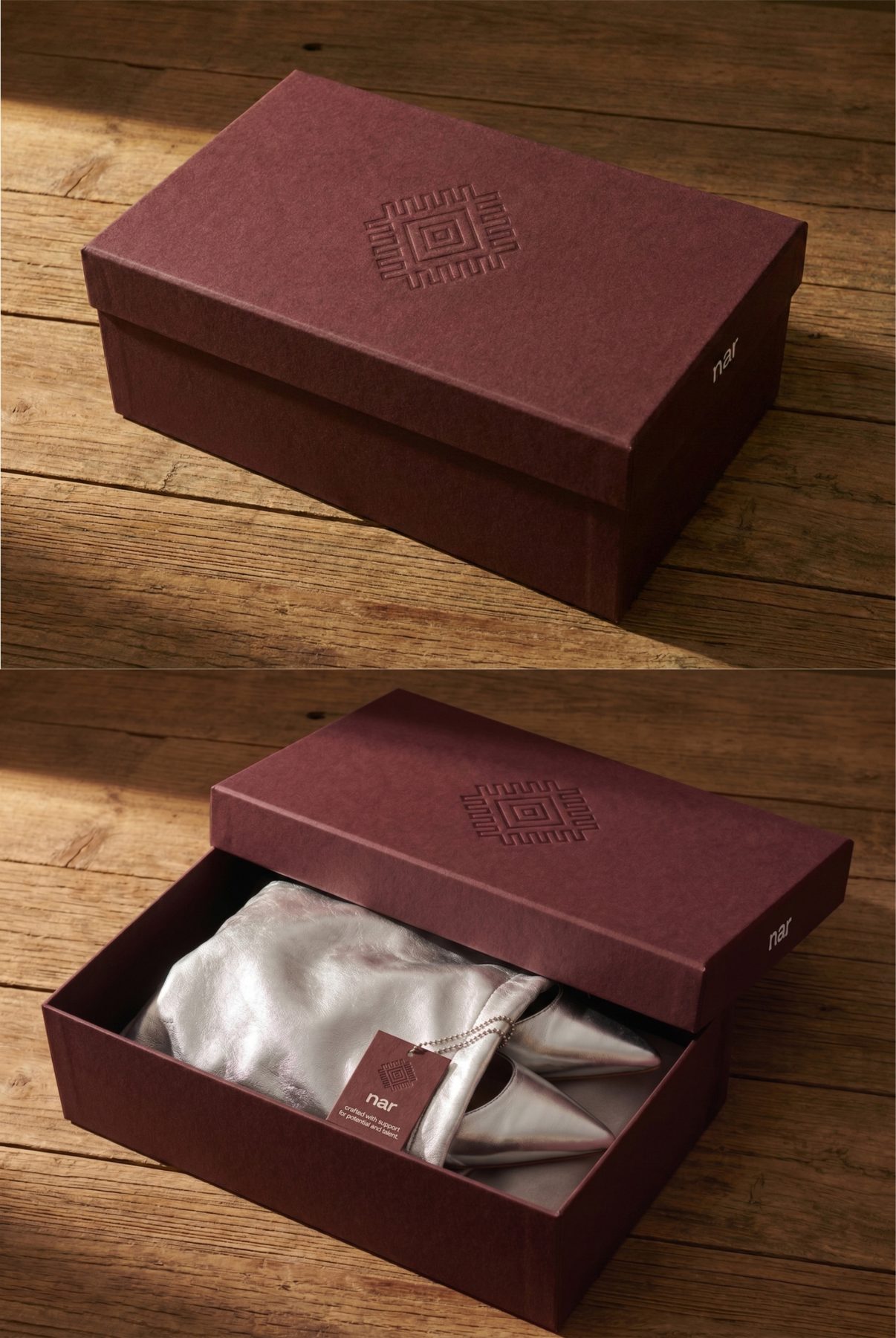
The identity centers on a single geometric logomark derived from the göz (eye) motif found in Anatolian kilims — a protective symbol woven into rugs across the region for centuries. Reduced to its essential lines, the mark reads as both ancient and engineered: a diamond within a diamond, framed by stepped rays that scale cleanly from embossed packaging to woven labels to architectural signage.
Ancient Mark, Modern Type
The wordmark is set in a lowercase contemporary sans-serif, deliberately quiet against the symbolic weight of the göz. This pairing — ancient symbol, modern type — defines the brand's typographic register: rooted but not nostalgic, geographic but not folkloric. Hierarchy is maintained through scale and spacing rather than weight or color.
System as Framework
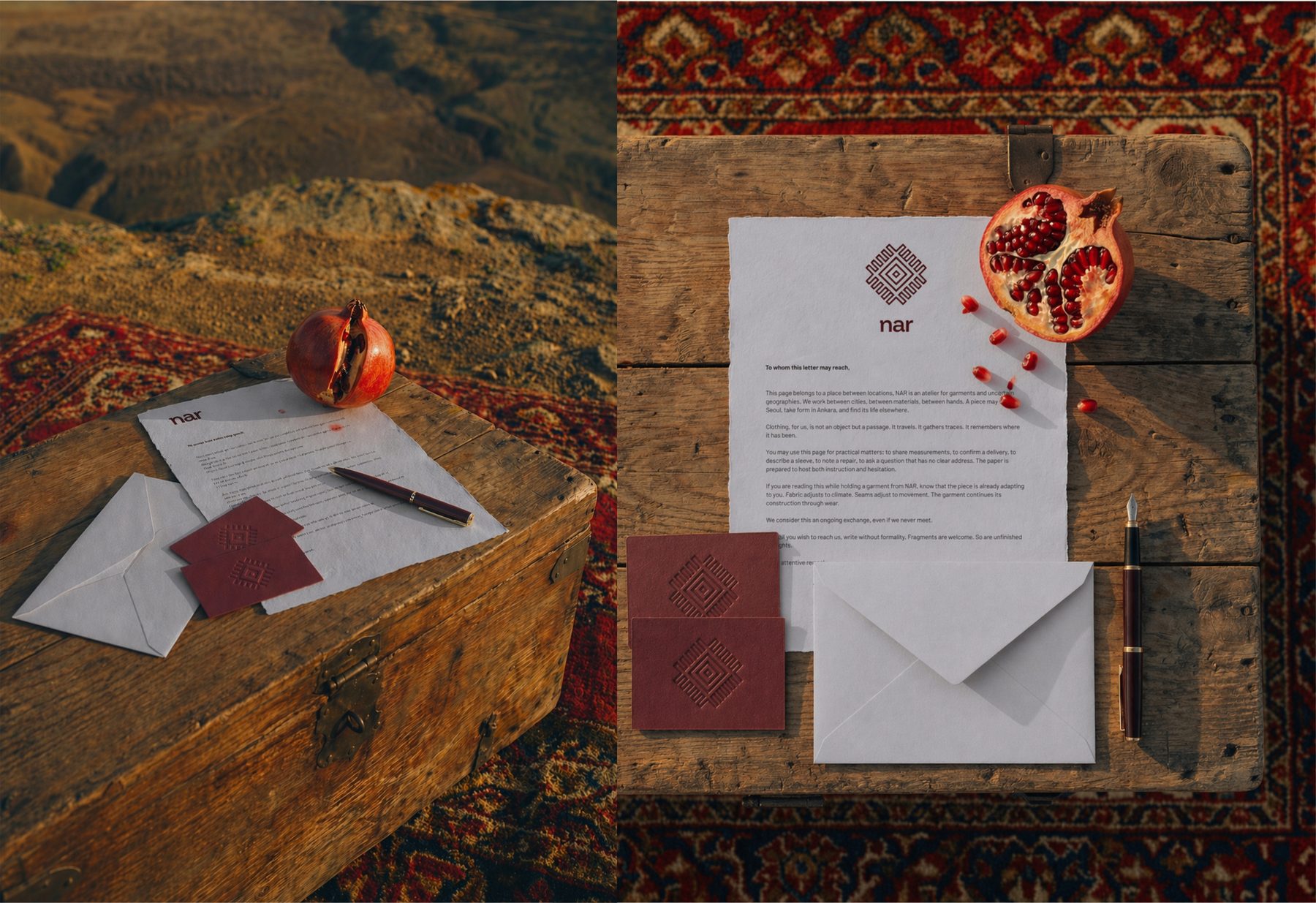
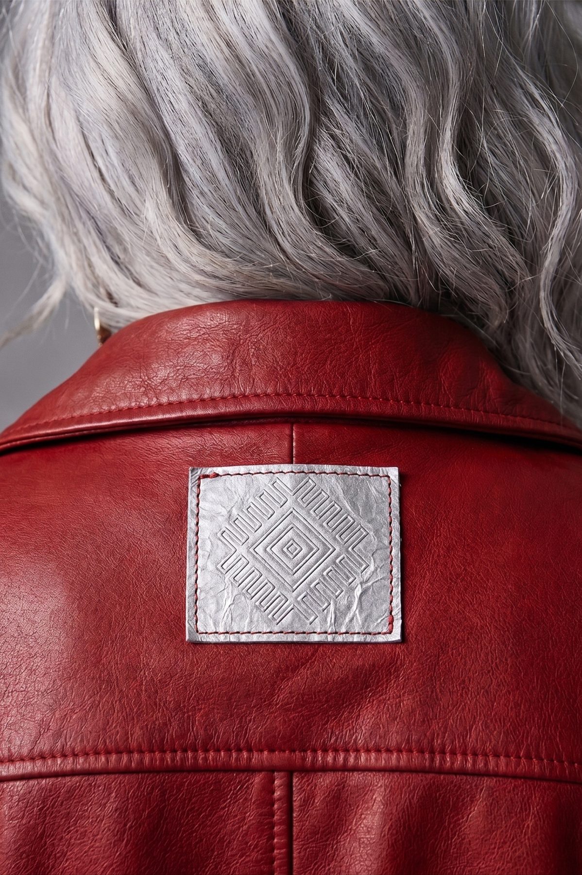
Applications extend across print, packaging, communication, and garment construction — the embossed shoebox, the deckle-edge letterhead, the silver leather patch stitched onto burgundy outerwear. Where other brands stamp their logo, NAR embosses, debosses, or weaves it — letting the mark sit within the material rather than on top of it.

Color as Identity
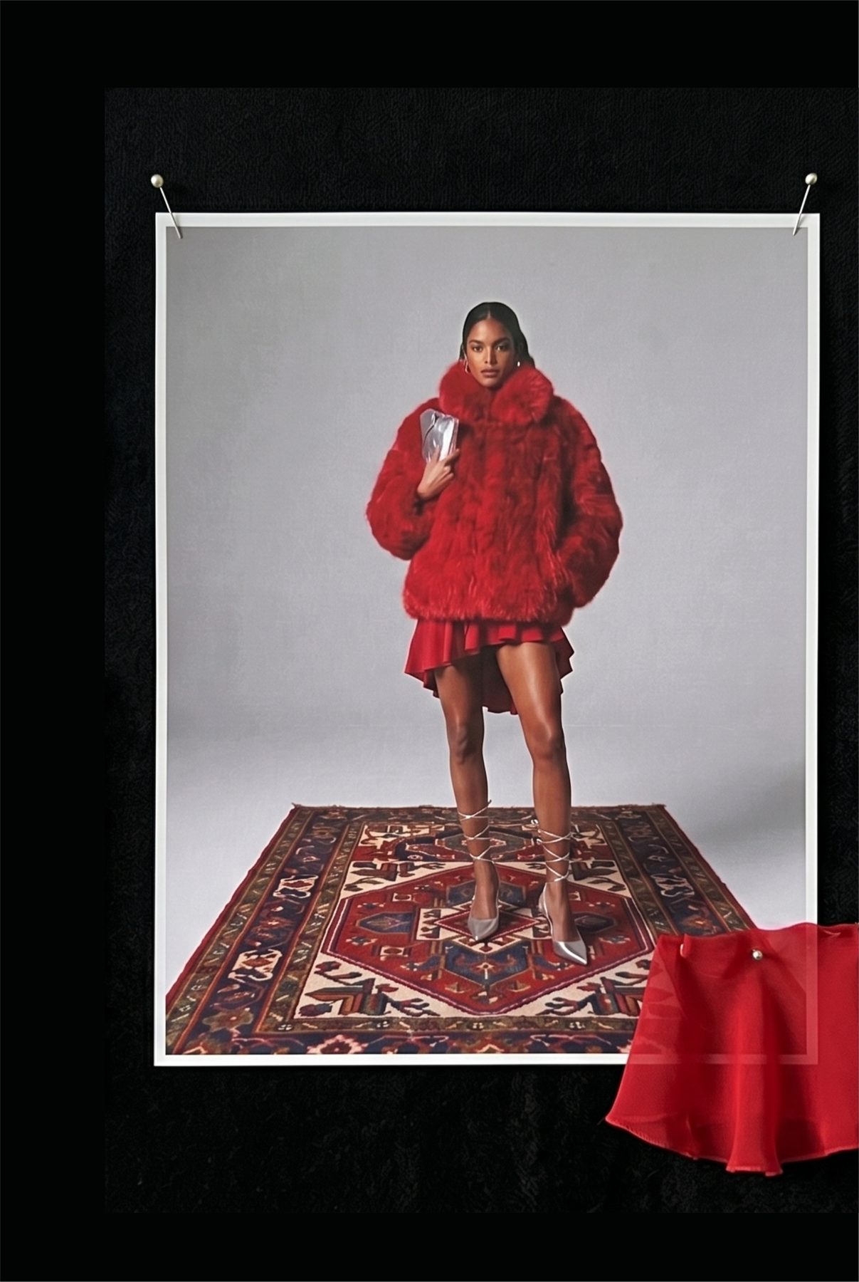
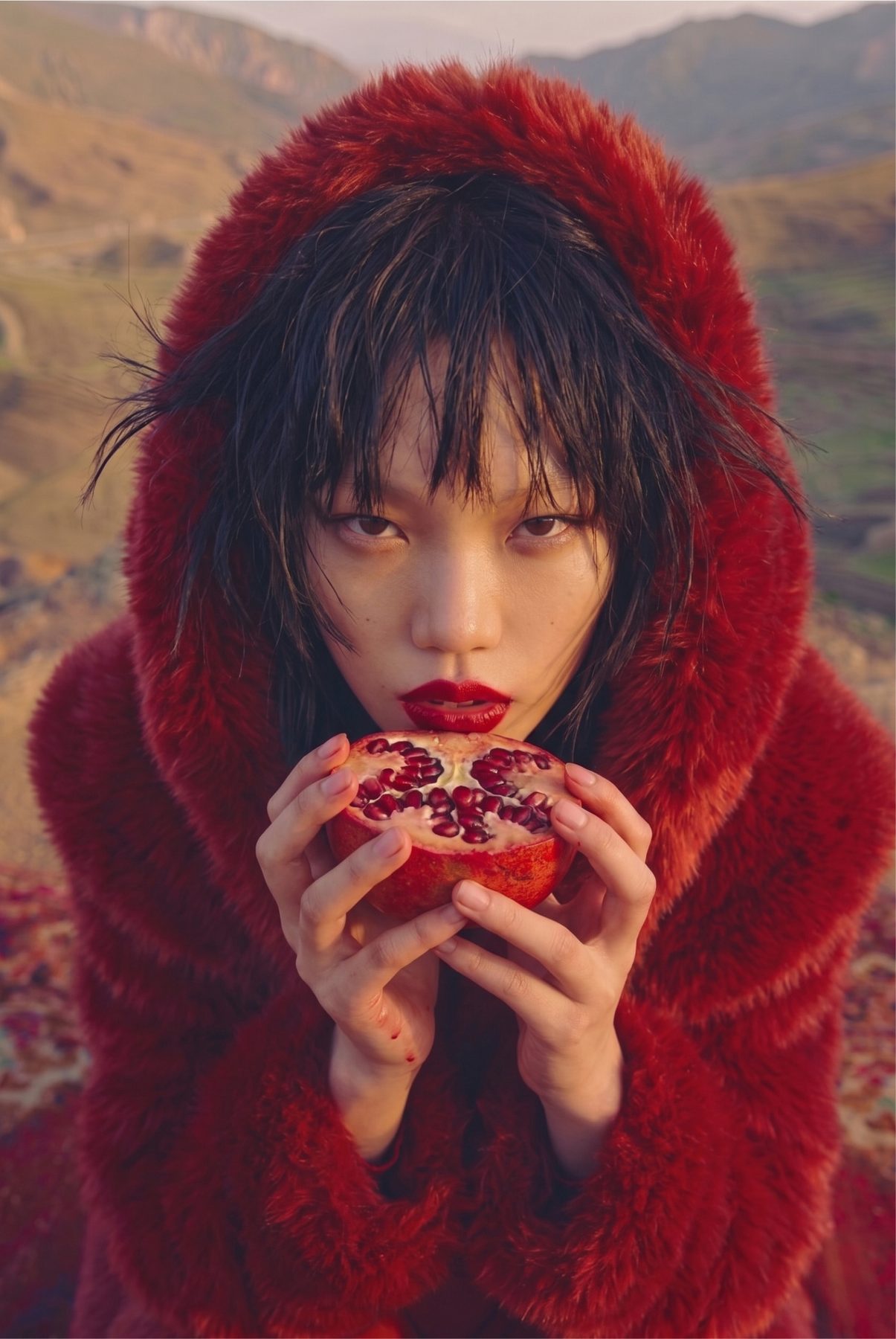
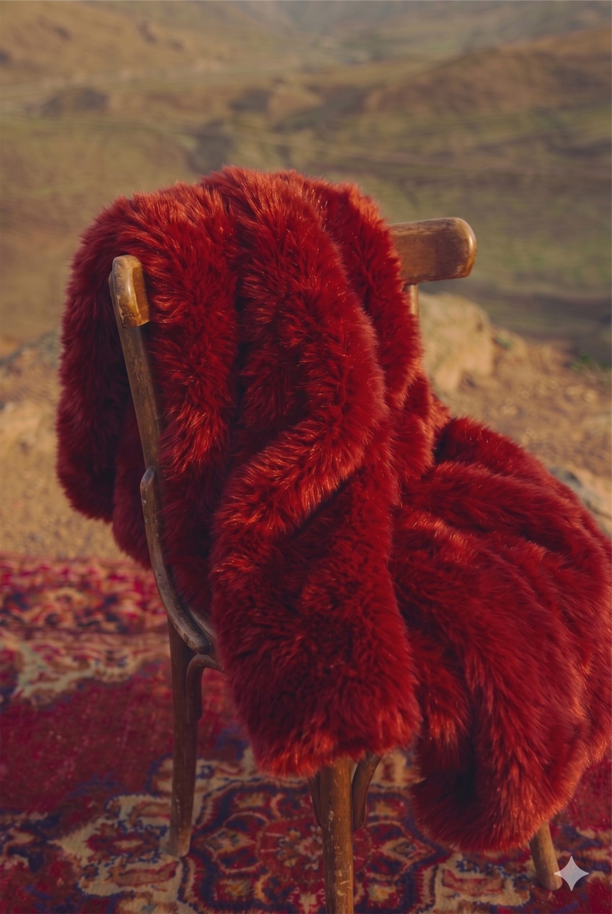
The visual language is built on a restrained palette of deep burgundy, warm natural tones, and metallic silver. Burgundy carries the brand's name through every surface — pomegranate flesh, dyed wool, Anatolian earth at sunset — while silver functions as a counterpoint: cool, contemporary, reflective. The two colors recur across garments, accessories, packaging, and environments.
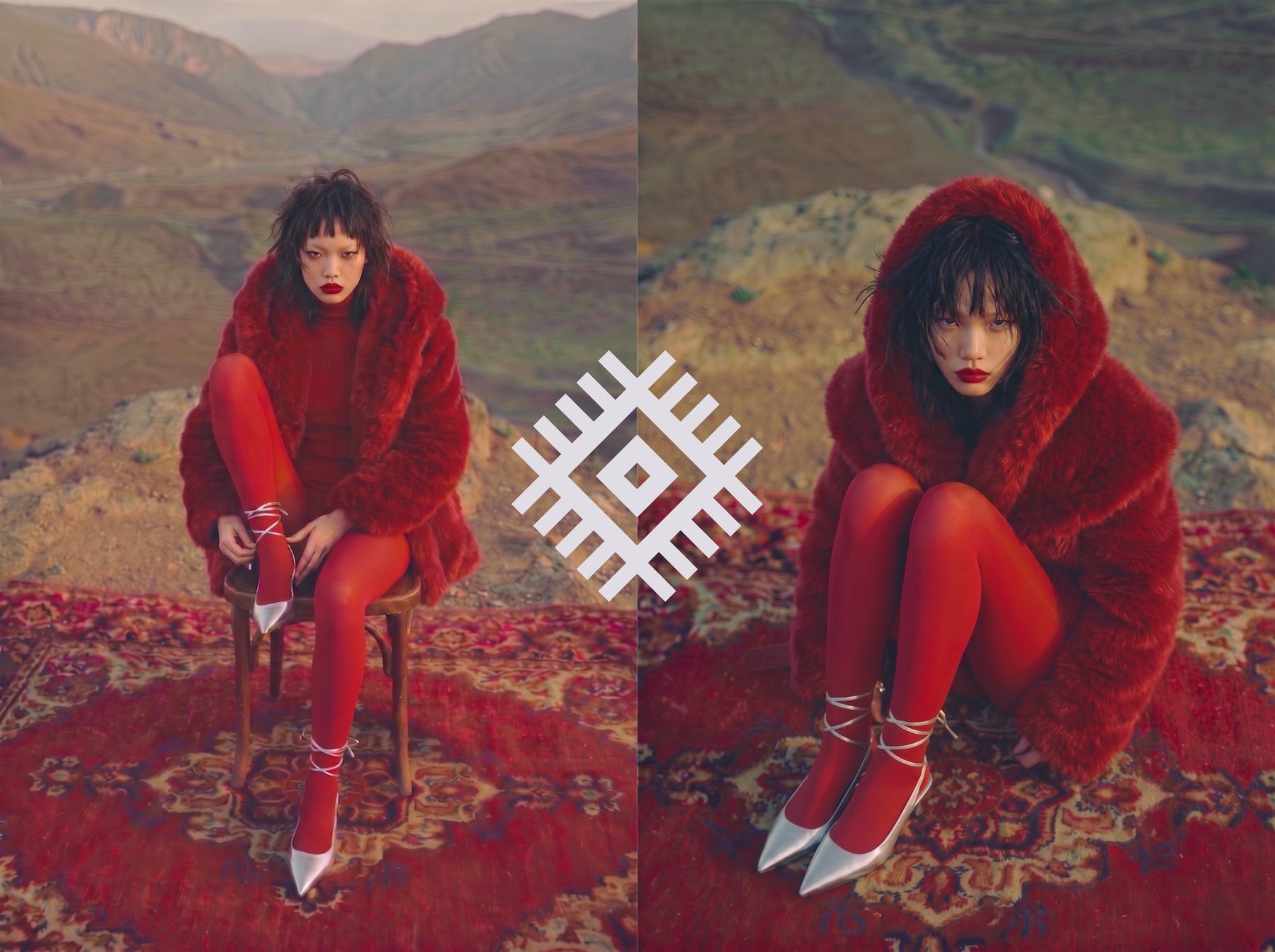
Inhabitants, Not Models
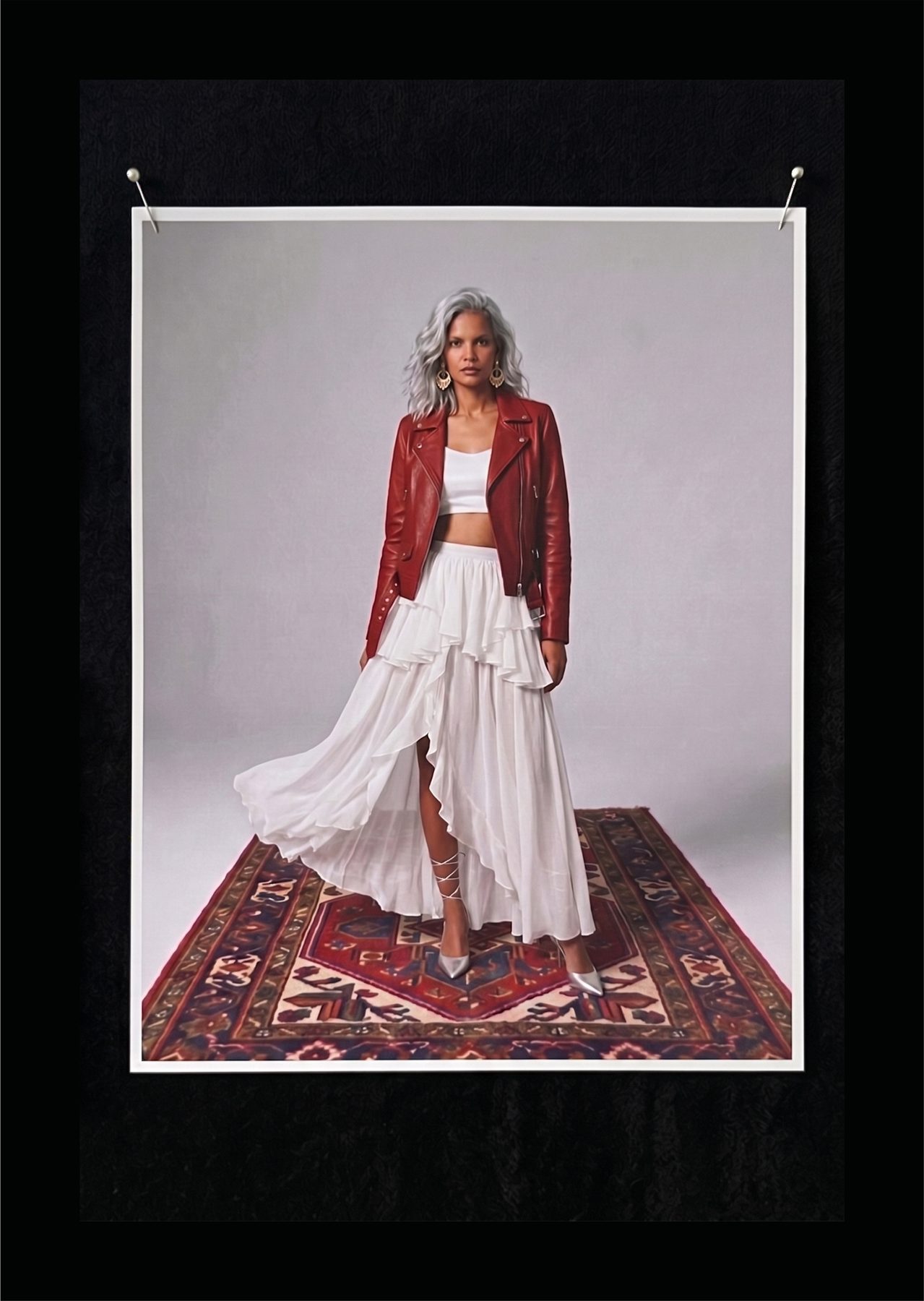
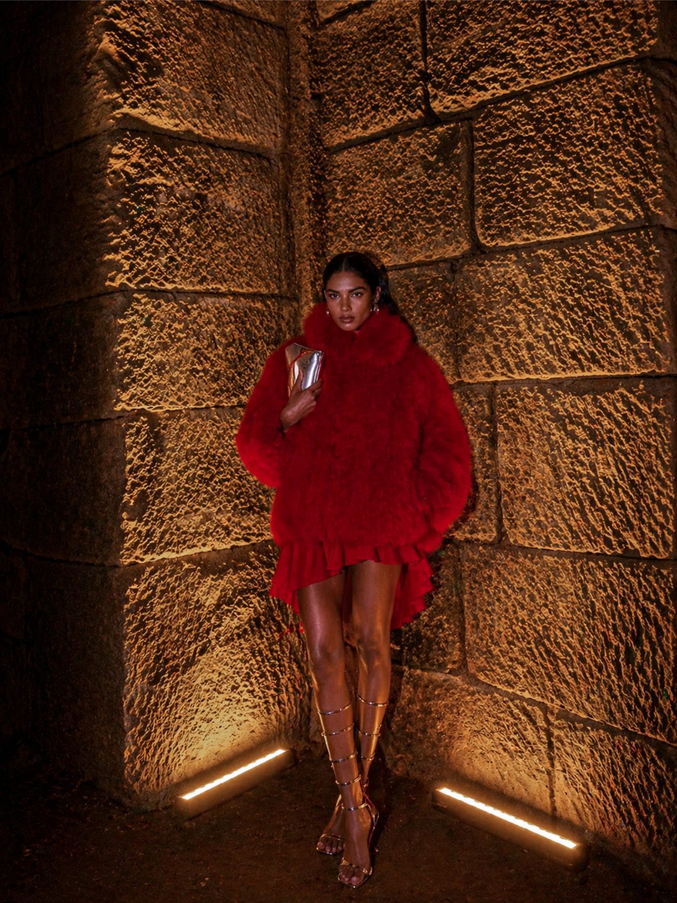
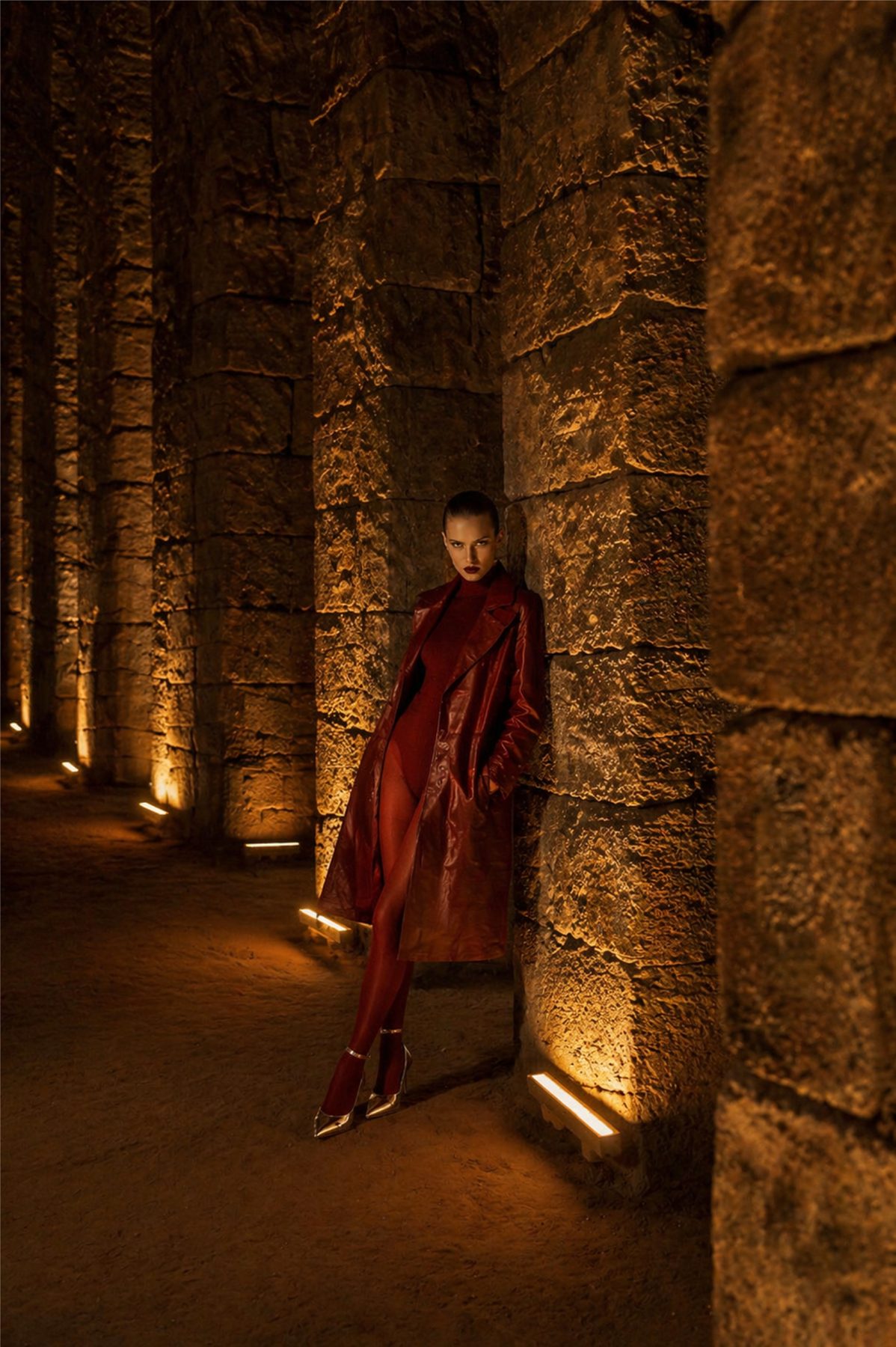
Imagery emphasizes texture, tactility, and the relationship between objects and landscape. Campaigns are staged within grounded environments — sandstone architecture, woven rugs, mountain terrain — where styling, composition, and atmosphere construct narrative without relying on explicit storytelling. Models are framed as inhabitants of a place rather than figures against a backdrop.
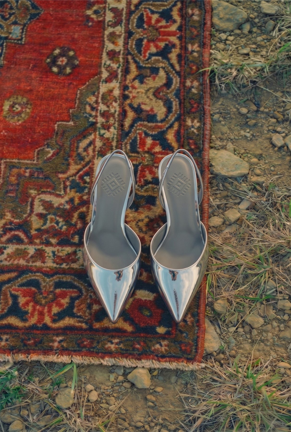
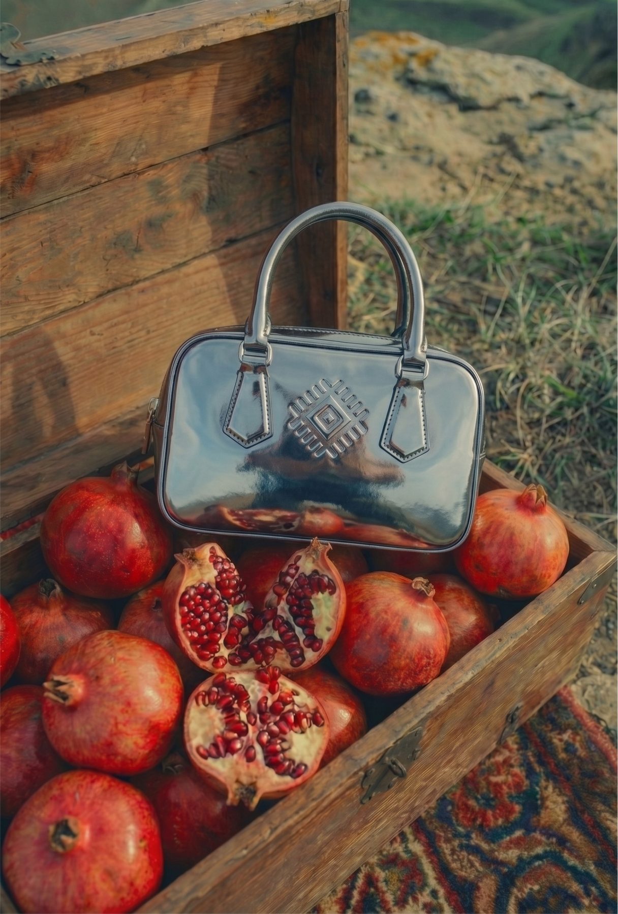
A Continuous World
The art direction treats each image as part of a continuous world. Whether the subject is a silver shoe on a Heriz rug, a model in red leather between sandstone columns, or a bag set among split pomegranates in a wooden crate, the materials, gestures, and spatial logic remain consistent — building cumulative recognition across surfaces.
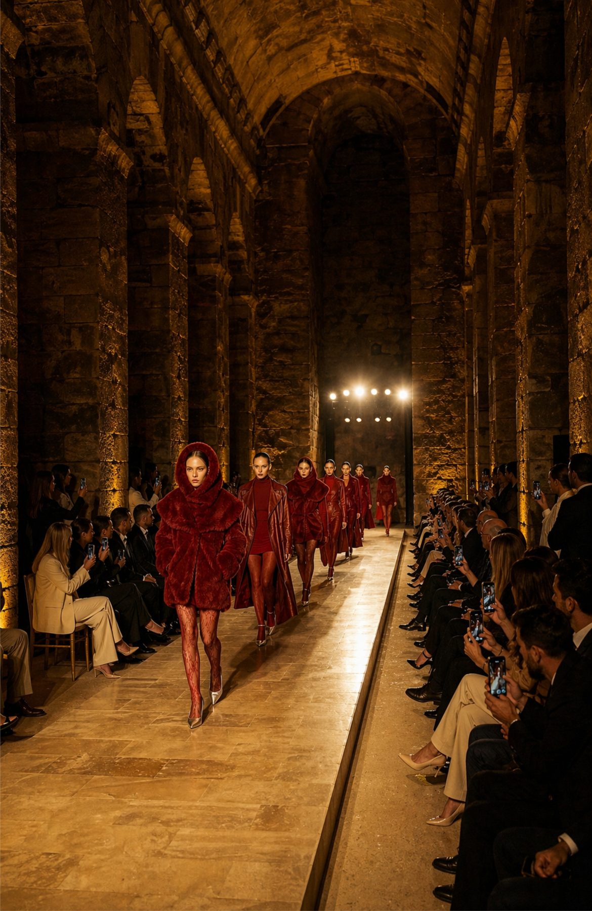
Mardin as Anchor
The brand's spatial anchor is a vaulted sandstone hall in Mardin — a historic structure of cut stone, low warm light, and architectural permanence that grounds NAR in a specific geography. Rather than designing a generic showroom or runway, the brand inhabits an existing space whose materiality already carries the qualities the identity points to: weight, age, hand-built craft.
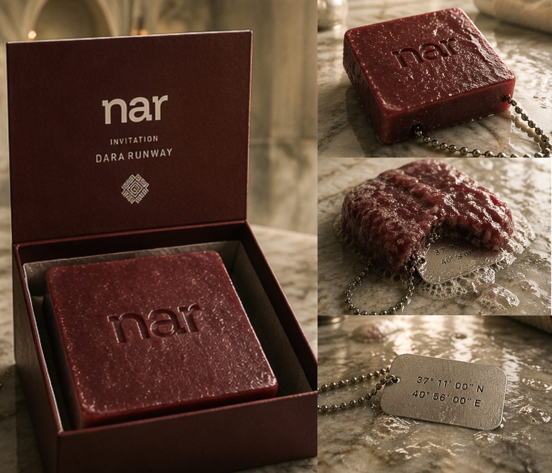
Invitation as Object
The runway invitation extends this material logic into the hands of guests. Each invitee receives a block of red soap embossed with the NAR wordmark, packaged in a burgundy box, accompanied by a steel tag stamped with the coordinates of the Mardin venue. The soap is functional but ephemeral — it dissolves with use, mirroring the brand's framing of clothing as passage rather than possession.
Atmosphere as Proposition
Events are conceived as temporary installations rather than commercial showings, activating the brand through atmosphere, scale, and ritual. The space, the object, and the body operate as one continuous system — visitors don't watch a presentation, they enter a constructed world where every element, from the stone walls to the soap in their hand, has been considered as part of the same proposition.
PROTOKOL 001: SEOUL
POST-HUMAN DREAMS is the first iteration of PROTOKOL, an ongoing exhibition series that treats speculative experience as documented procedure. Each edition is anchored to a city and presents a set of protocols — instructional texts approaching altered, synthetic, or imagined states through the formal language of the technical manual.
Presented as part of a three-artist exhibition at FFK.
POST-HUMAN DREAMS
Protocol 01: Astral Projection
Protocol 02: Synthetic Consciousness
Protocol 03: A Catalogue of Future Emotions
Protocol 04: Edge of the Interface